Kung Pow Marketing – Marketing Agency Branding
Location: Nashville, Tennessee
Client Type: S.E.O. and Digital Marketing Company
Project Type: Brand Identity Design ( Re-Brand )
Learn More: www.kungpowmarketing.com
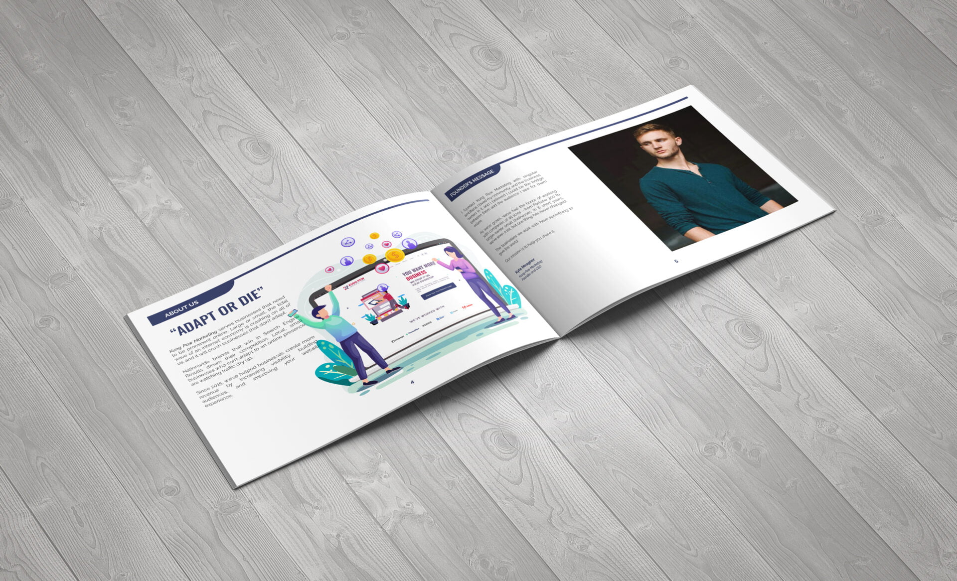
The Challenge: Kung Pow Marketing serves businesses that need to be prominent online. Large or small, the tidal wave of an internet economy is crashing on all of us; and it will crush businesses that don’t adapt. Nationwide brands that win in Search Engine Results drown their competition. Local, small businesses that can’t adapt to an online presence are watching traffic dry up. Since 2015, we’ve helped businesses create more revenue by increasing visibility, building audiences, and improving their website experience.
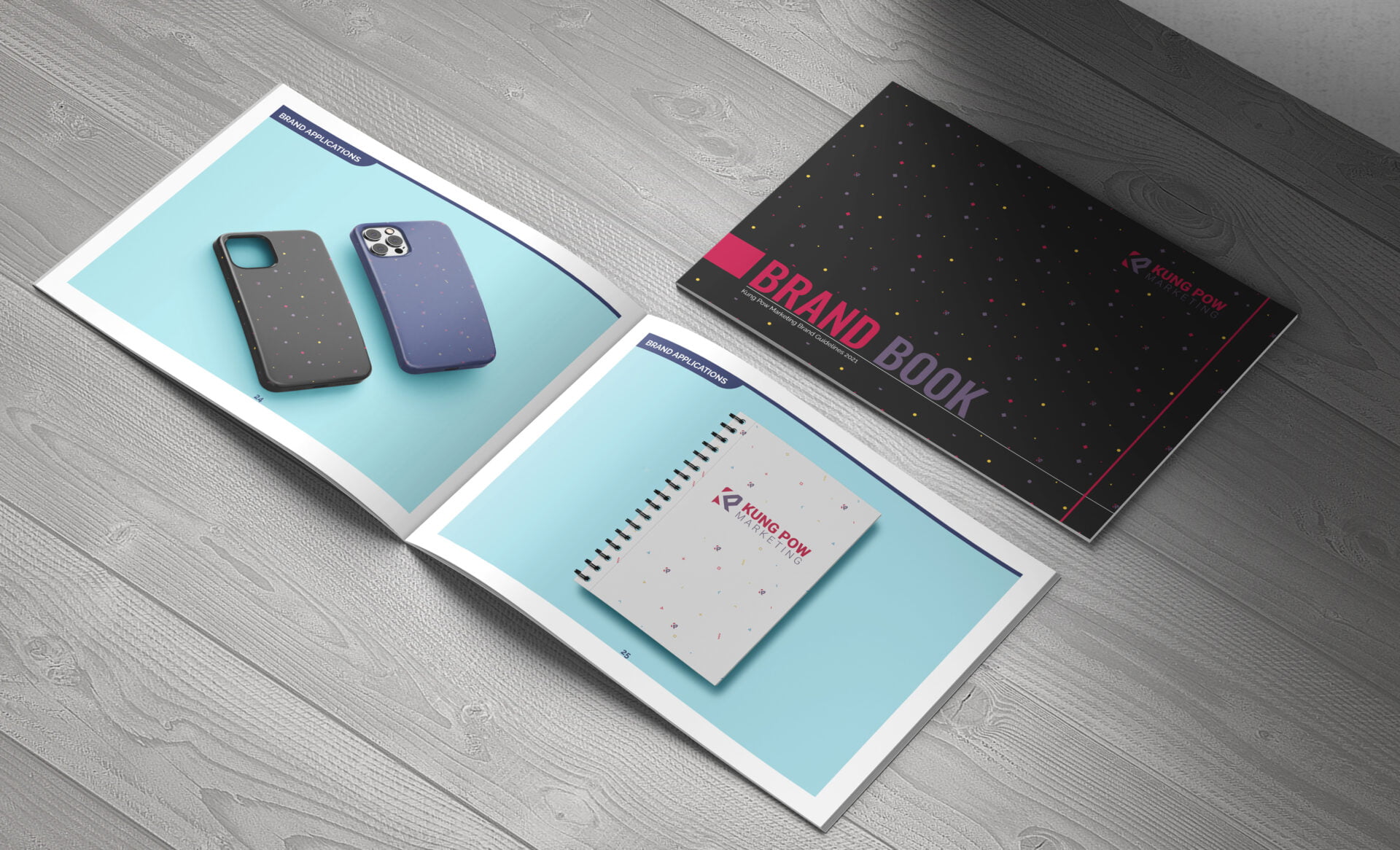
The company has been hacking it with some pretty informal design guidelines up until they decided to rebrand. The agency would also like to formalize its brand guidelines.
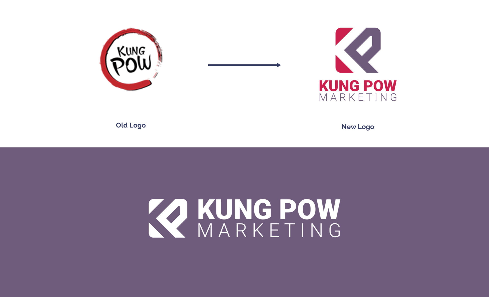
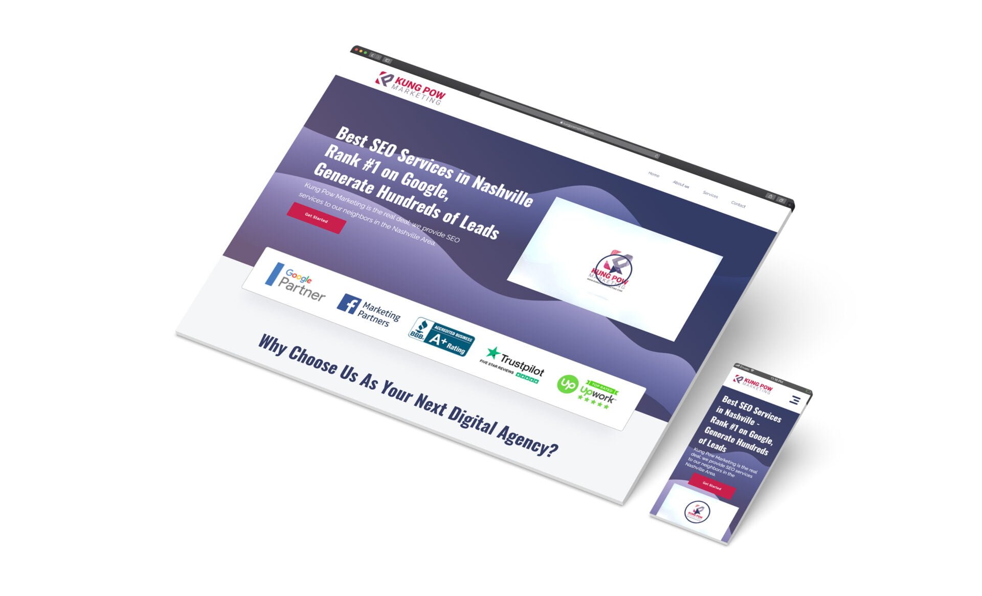
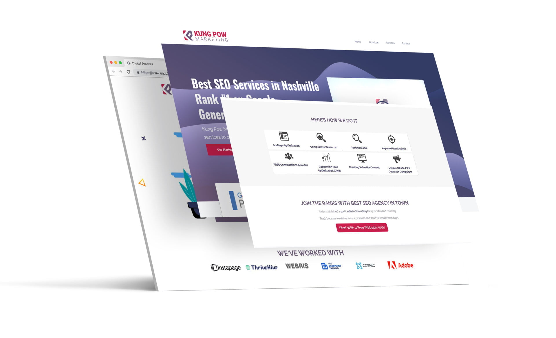
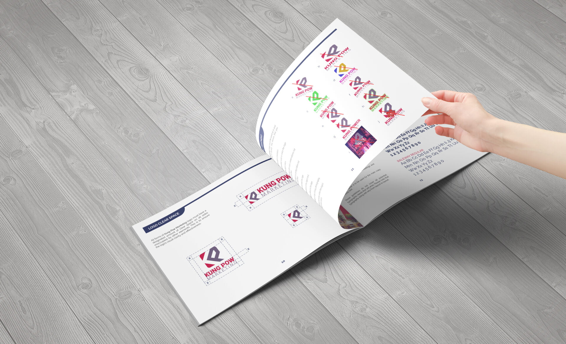
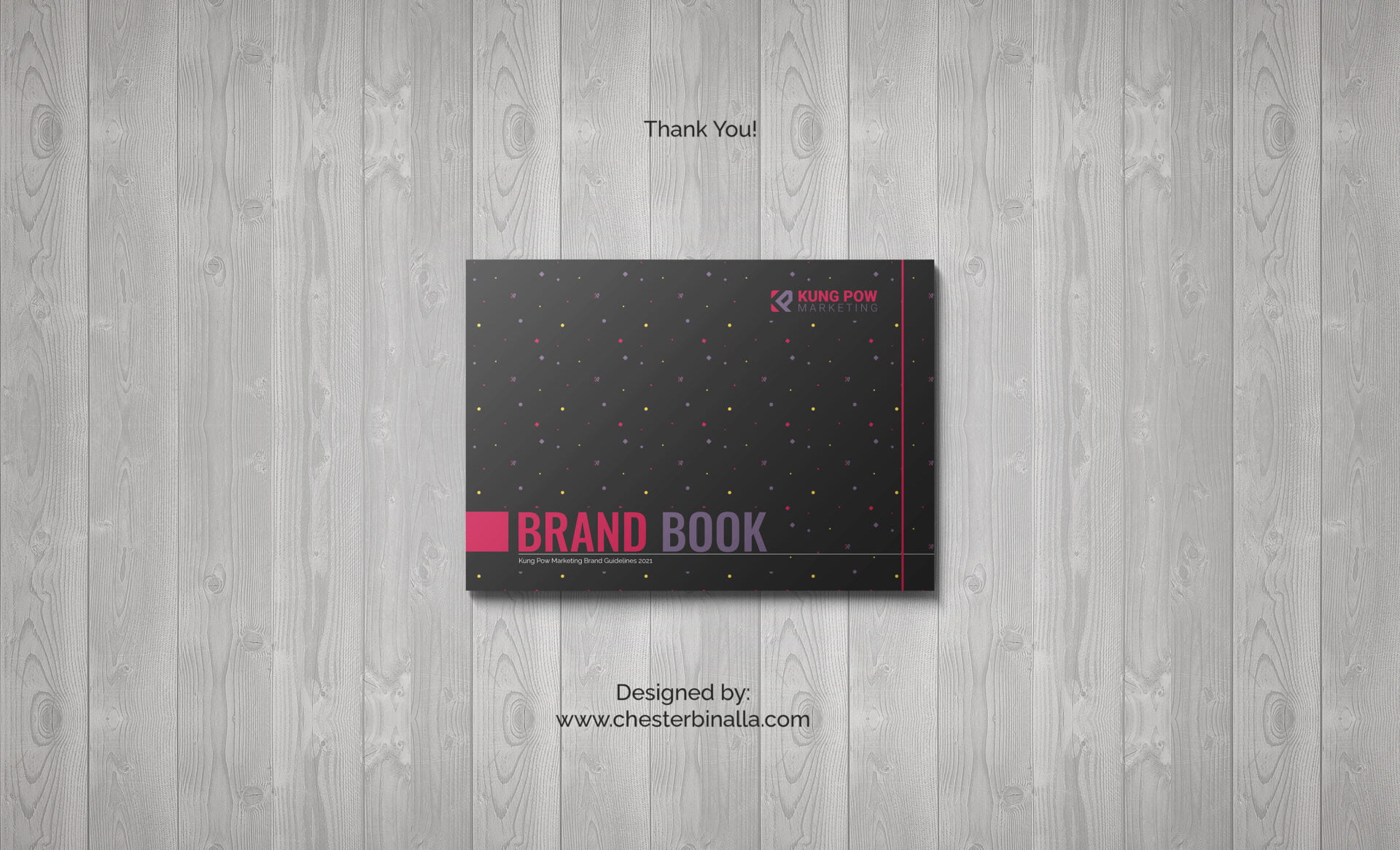
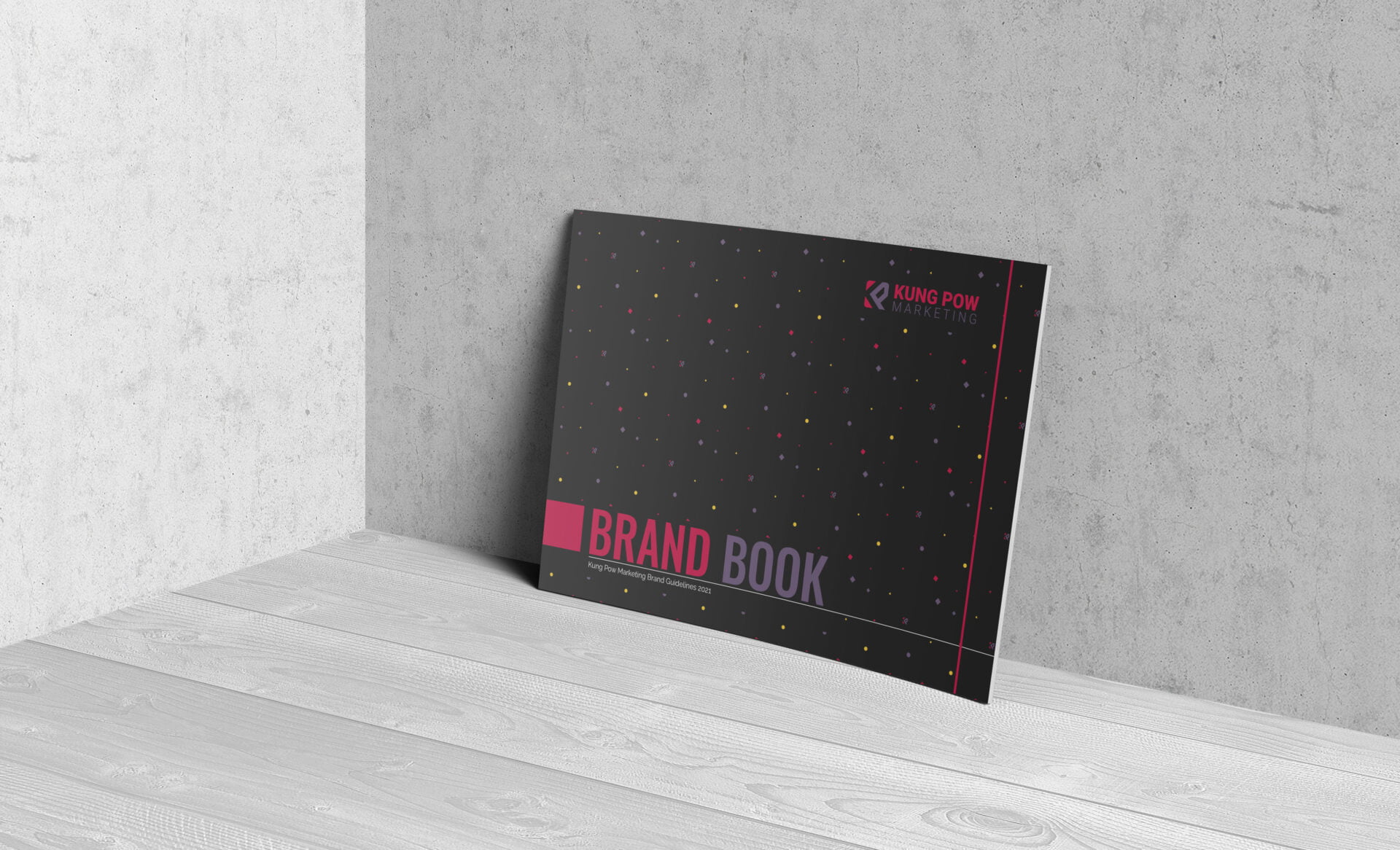
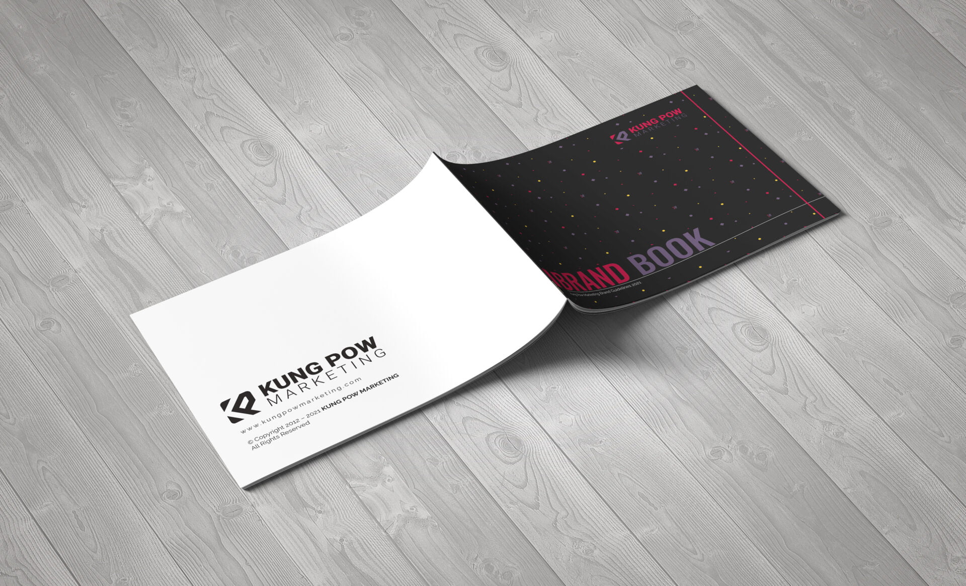
The brand guidelines document needs to be based on their current website design, colors, logos, etc… The agency also needs to update and formalize the logo design, and website design. The company is also seeking an expert to advise on some tweaks they could make that would improve the overall presentation and mood of the brand.
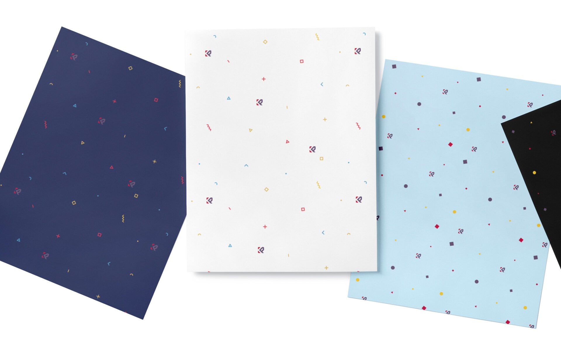
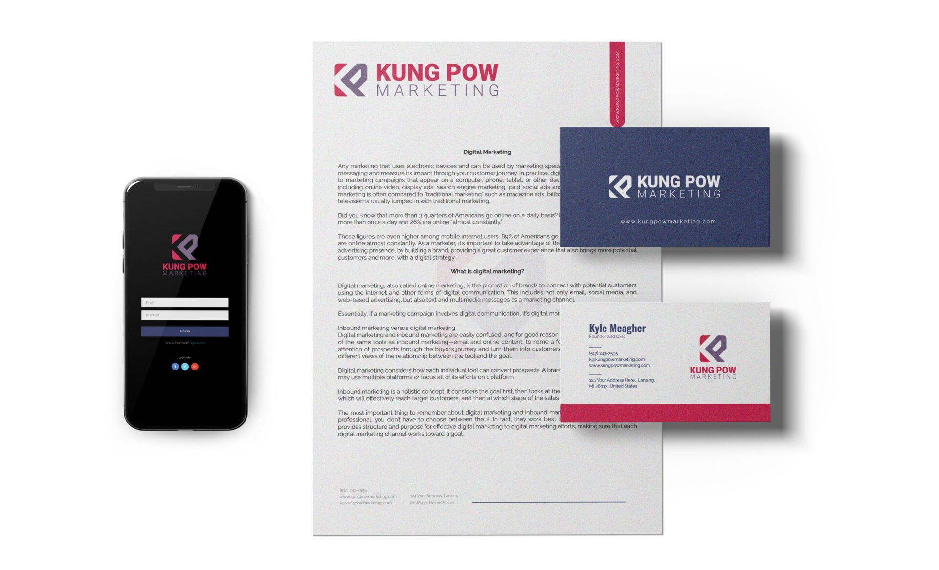
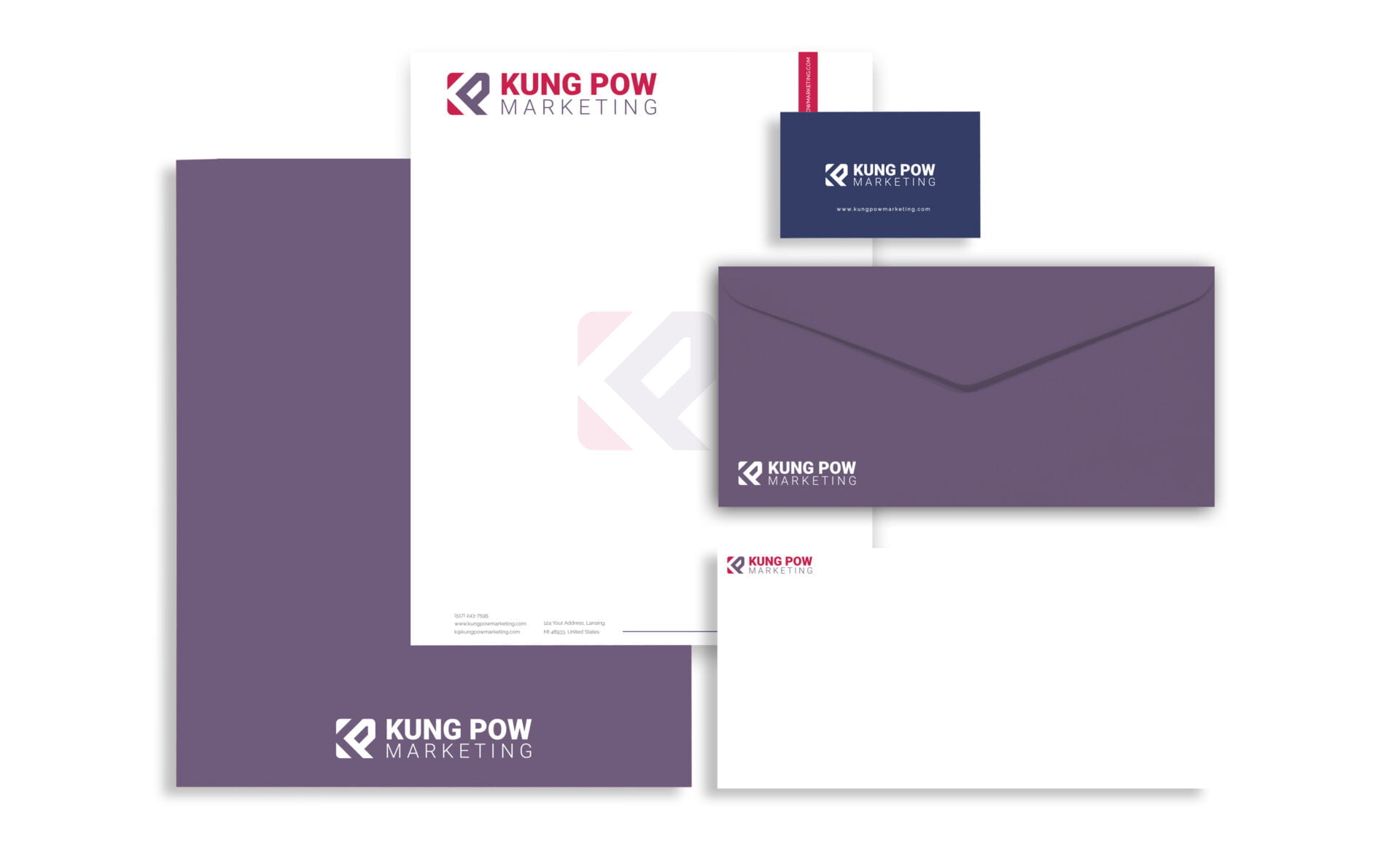
After defining the brand guidelines, They also require an updating of the company templates in Google Docs and Slides to align with the new brand guide.
The Approach: After the discovery session I went straight on researching the market demographics and competition. I decided to move away from the cliché of digital marketing (No magnifying glass for logo etc….)
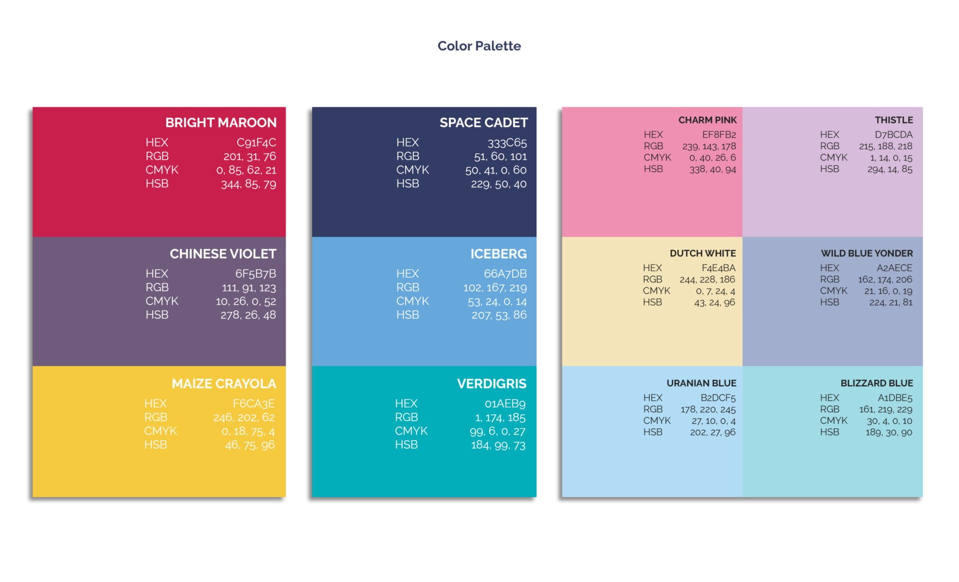
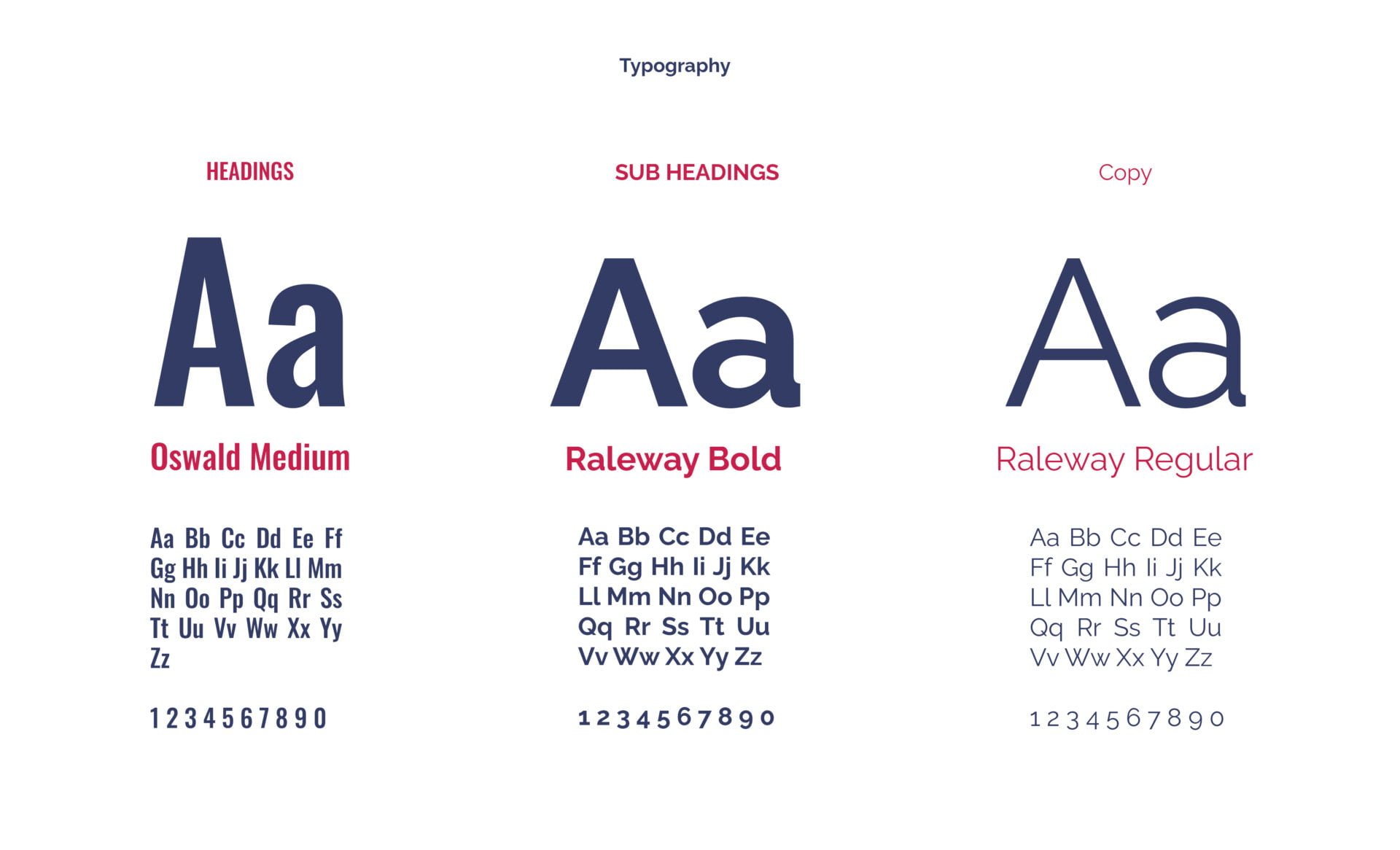
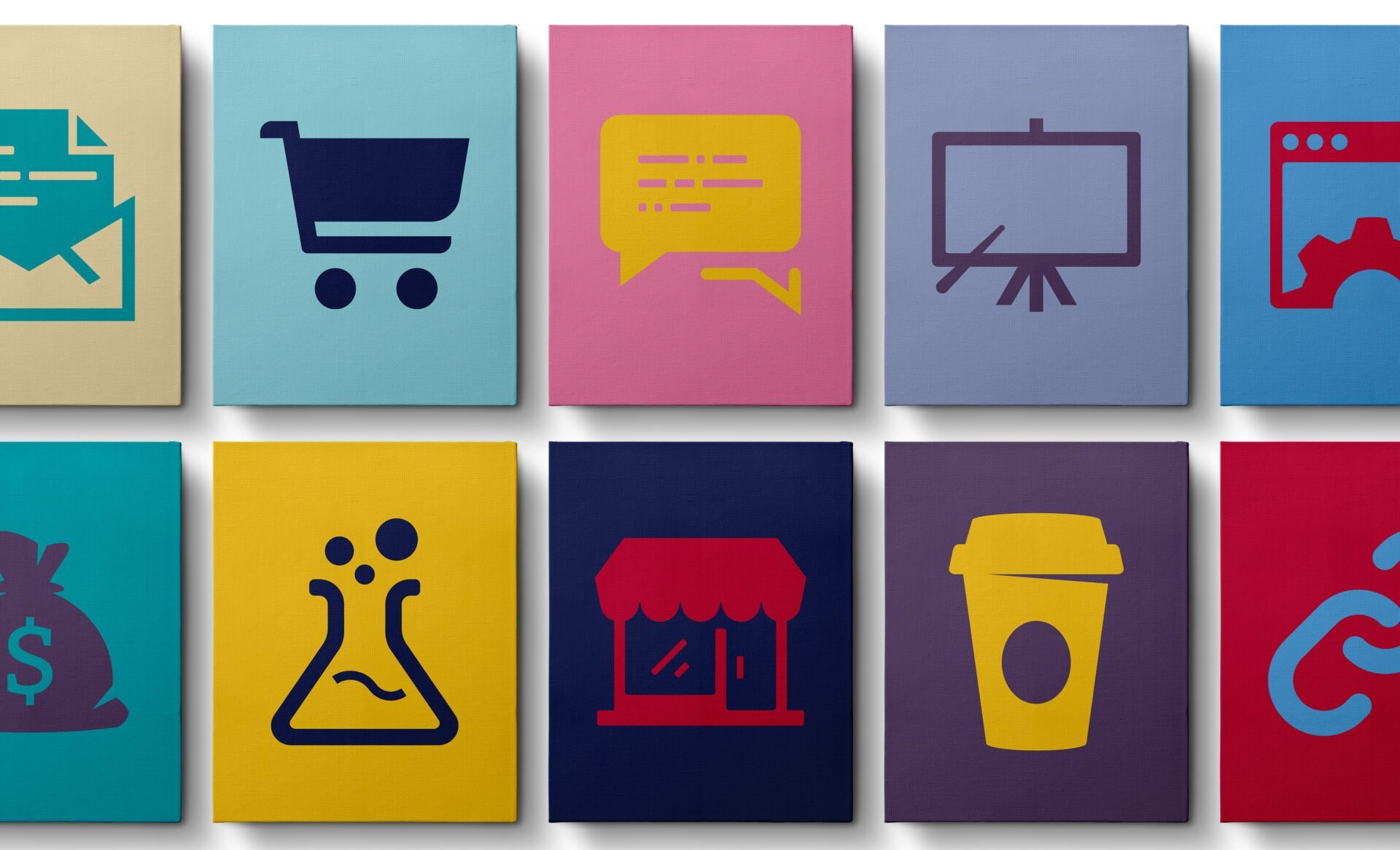
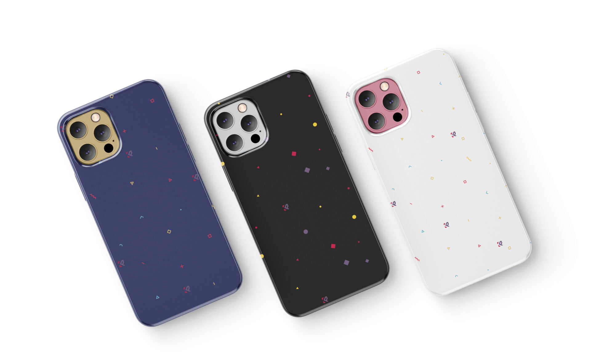
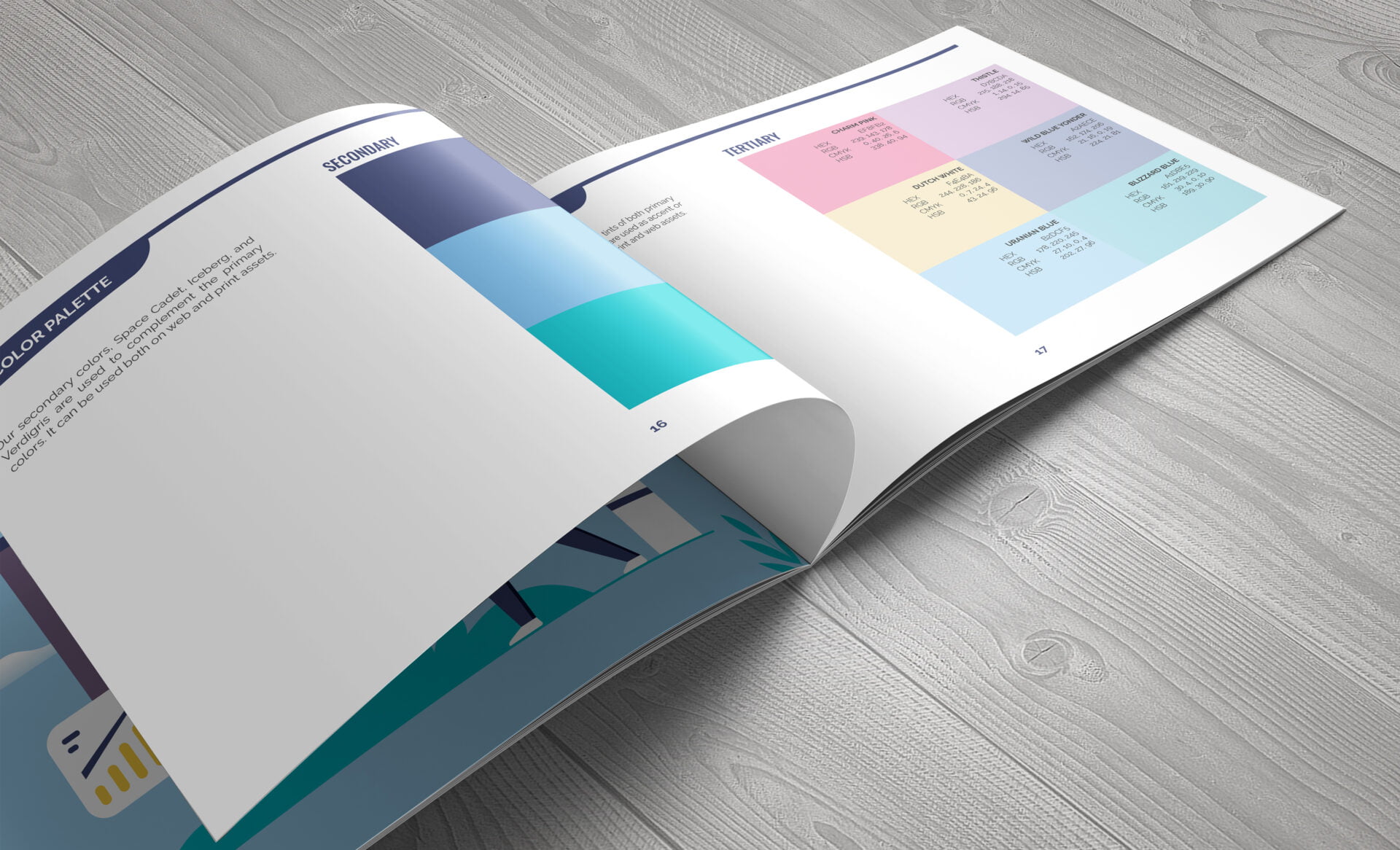
I added a diverse range of color palettes to give it more personality that reflects the brand attributes but still focuses on being passionate, professional, and expert. For typography, I went for a sans serif typeface family giving it a modern look.
Need Help With Branding?
Join Waitlist
Build a Brand That Attracts Loyal Customers
Brand Clarity Assessment
Free 3-minute assessment to find out if your brand is clear, aligned, and built to attract the right customers.
| Date: | November 8, 2022 |
