ELDIPH – Research and Learning Branding
Location: Bulli, NSW, Australia
Client Type: Performance Development Company
Project Type: Brand Identity Design
Learn More: www.eldiph.com
The Challenge: Eldiph, It’s a company that does research and designs learning and development frameworks for organizations with a focus on organizational performance and employee happiness. The organization focus on developing ethical and sustainable solutions using a 6-pillar ethical & sustainability performance framework.
The client wants the brand to be minimalistic (kind of like apple). With colors very simple, like Black, white & greys. He is also open to a monochromatic palette. One of the degrees that the client is doing is Neuroscience, and want the brand to feel commercial but also science-based.
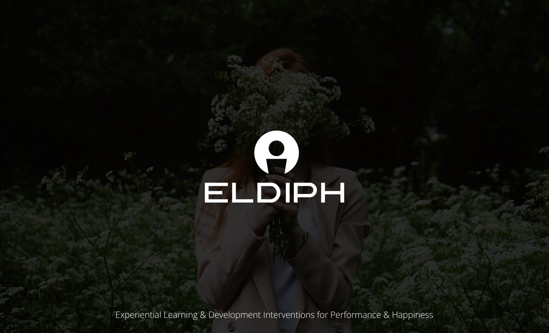
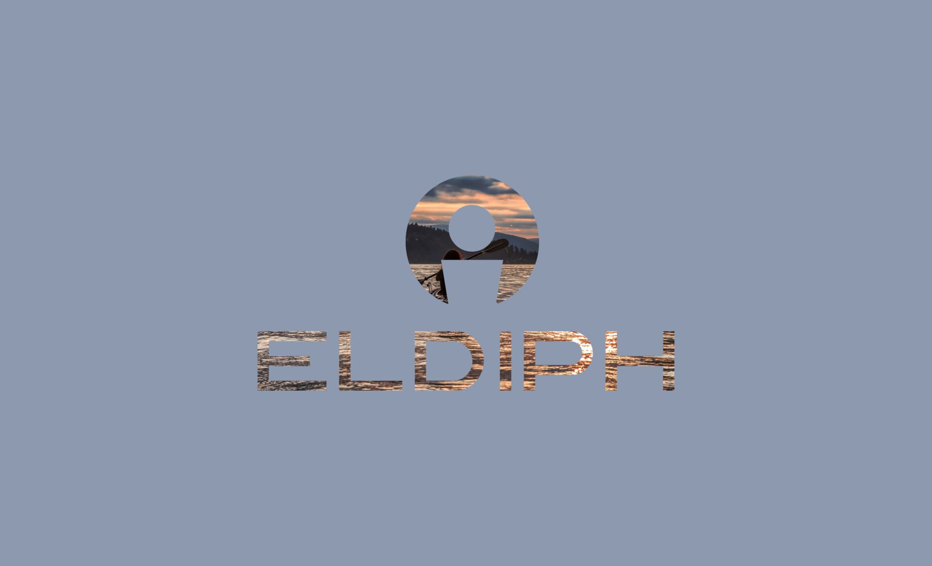
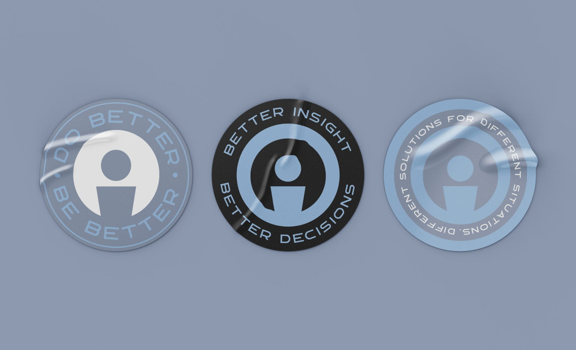
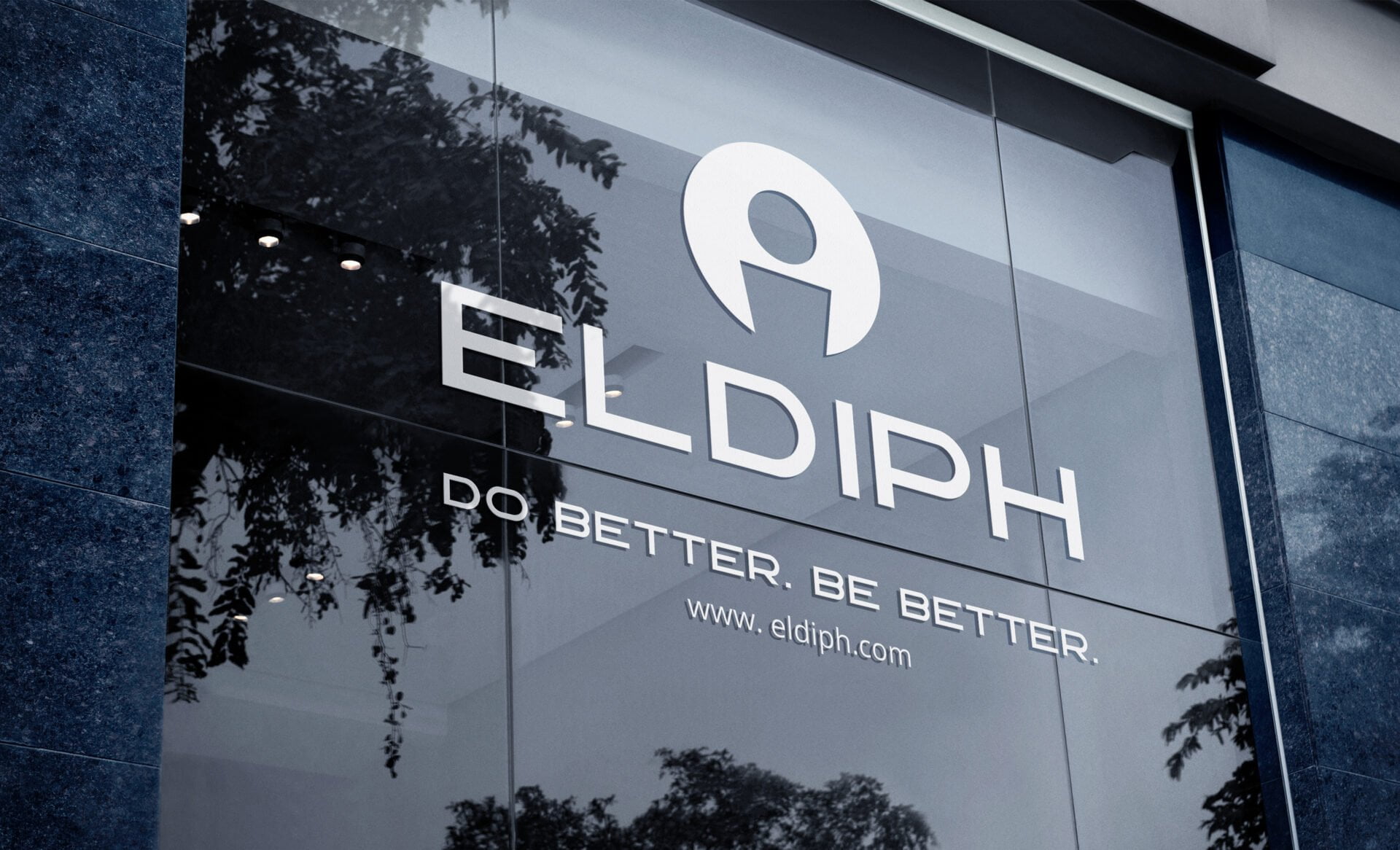
The client also made some sketches for an idea of a logo. basically, a person in the center of a circle wants it very minimalistic. The concept is that the company designs experiential learning and development frameworks for organizations. At the core, the concept is that the learner is at the center of the experience.
The Approach: The discovery session took us a few hours to complete. The brief and direction of how the visual design would go were very clear. I immediately started researching the company’s main competitor. Also did some research on the industry ( not much to see though ).
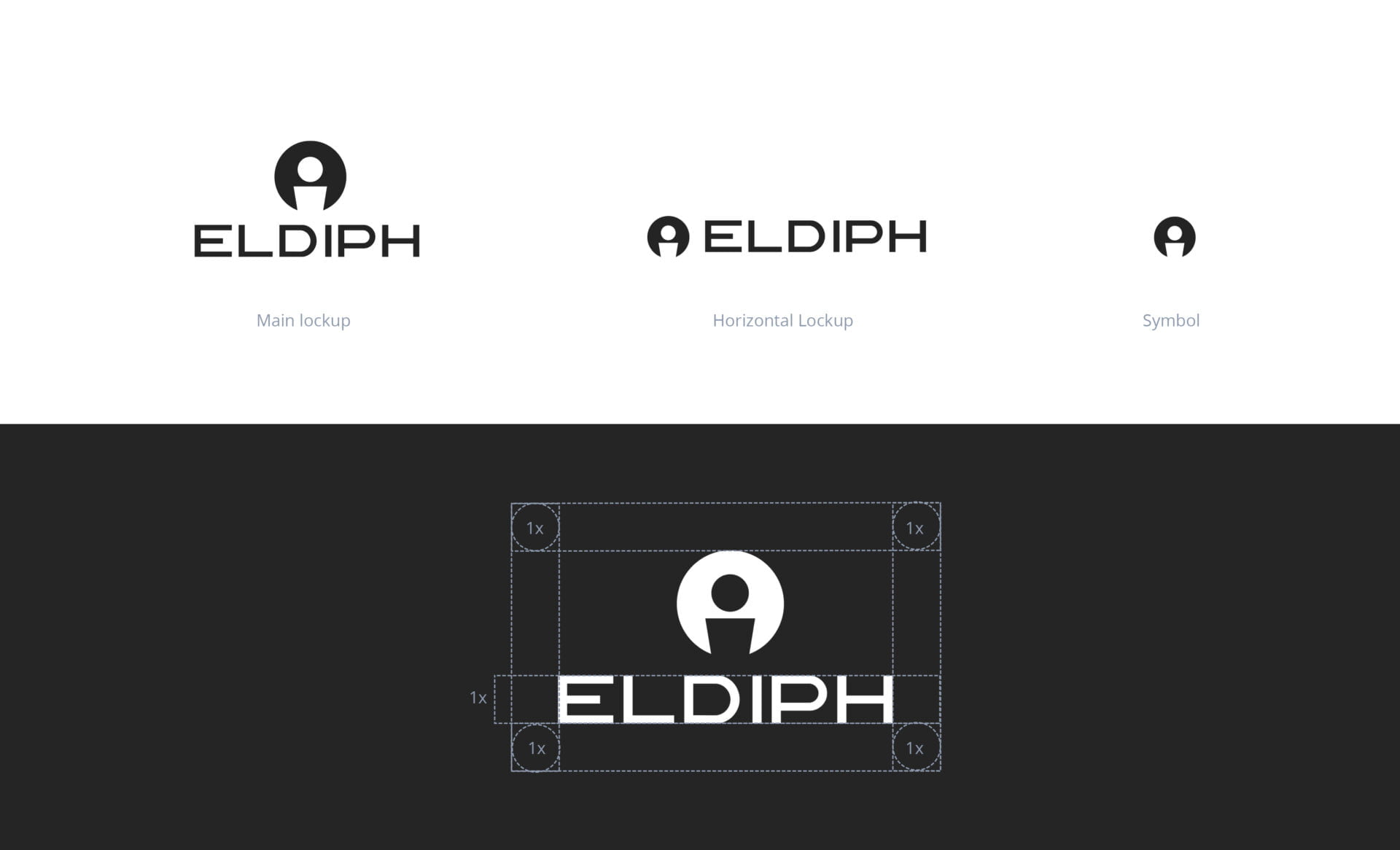
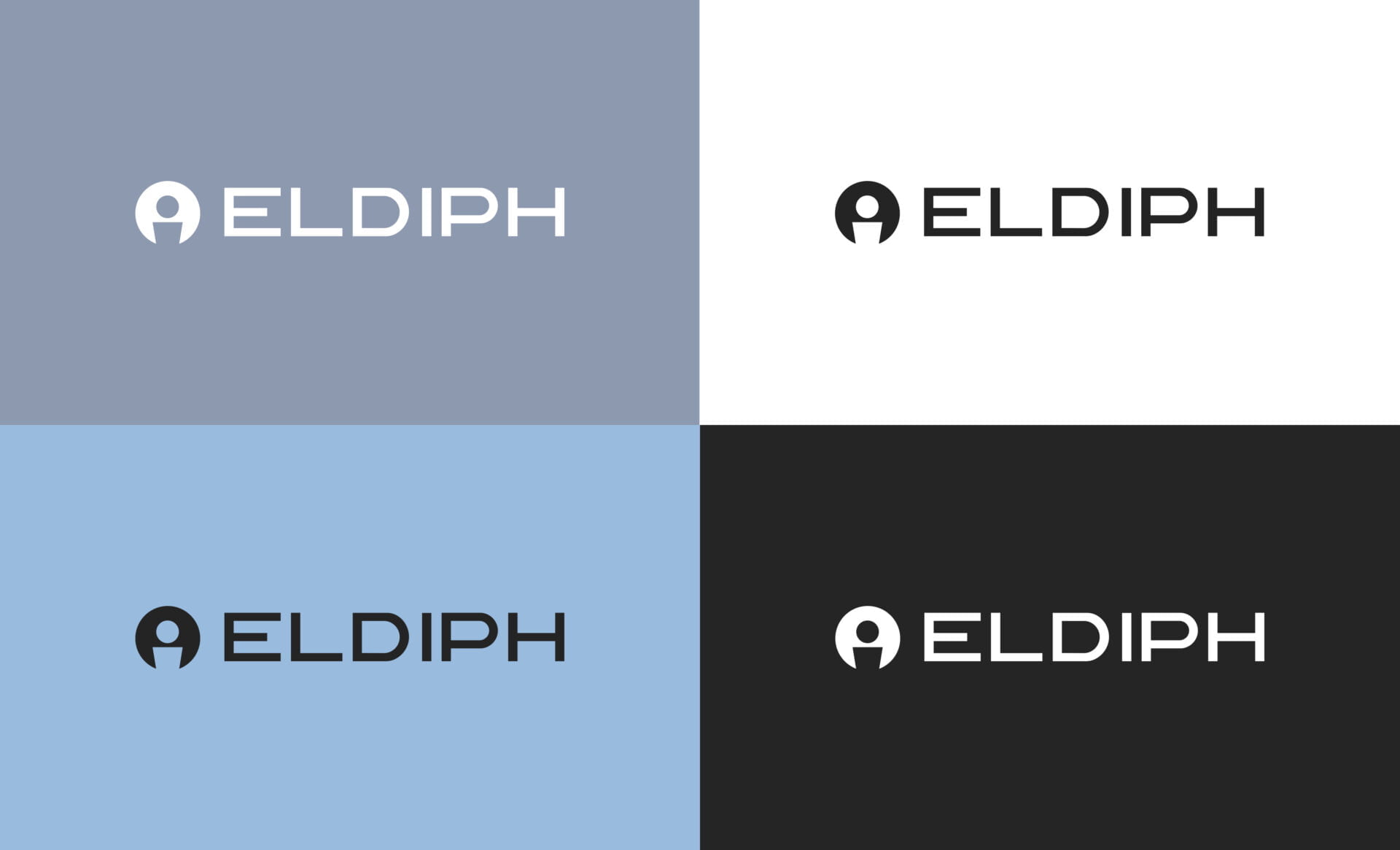
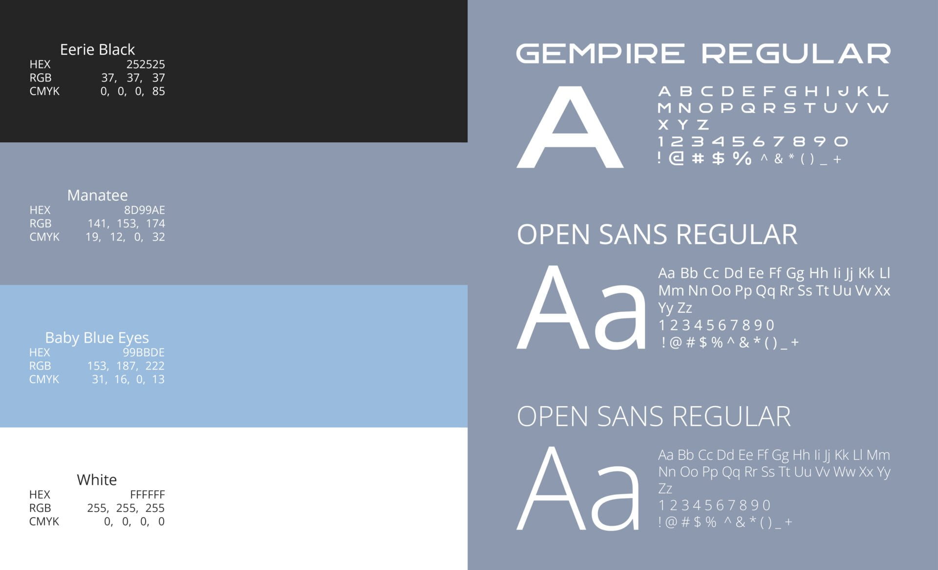
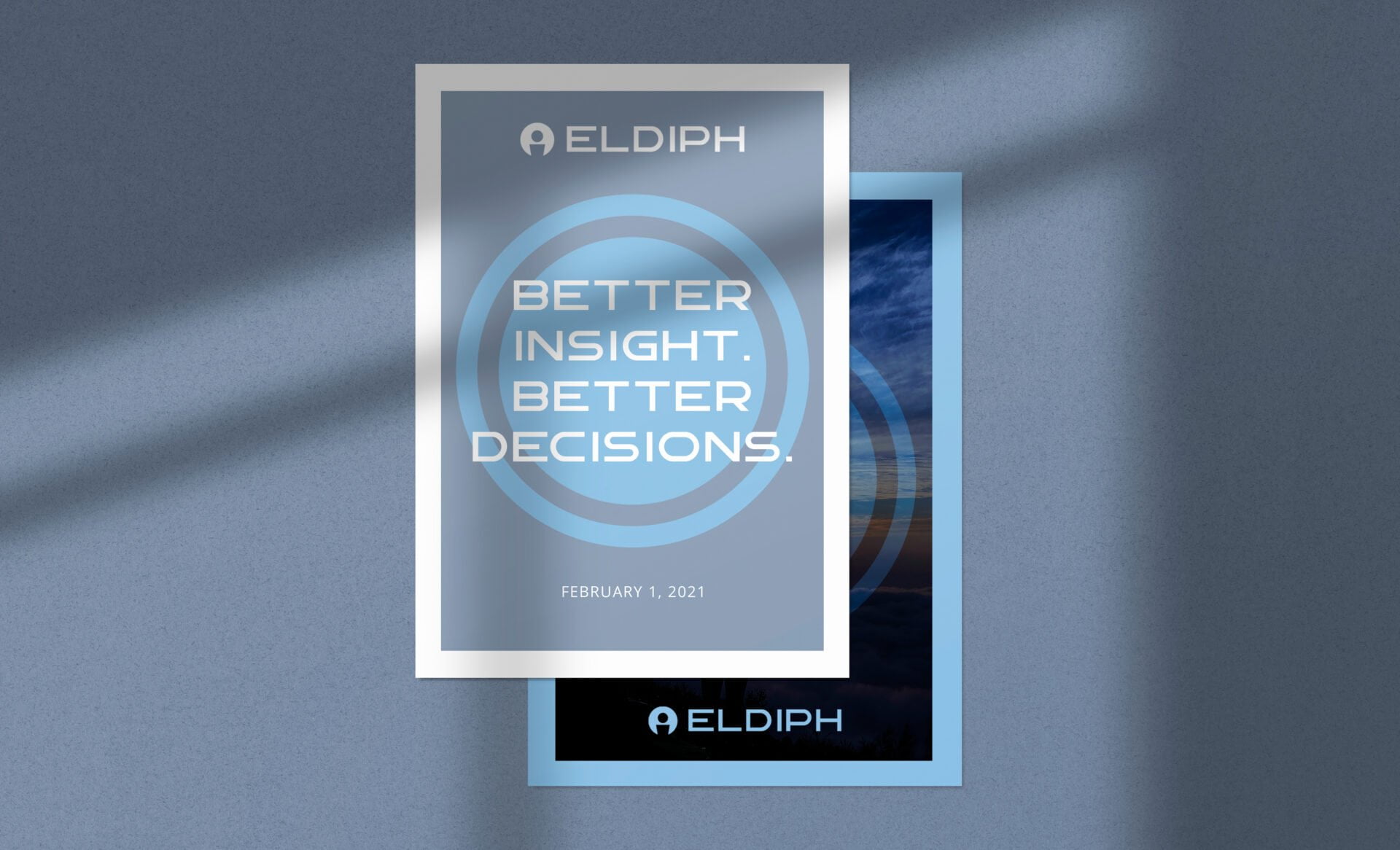
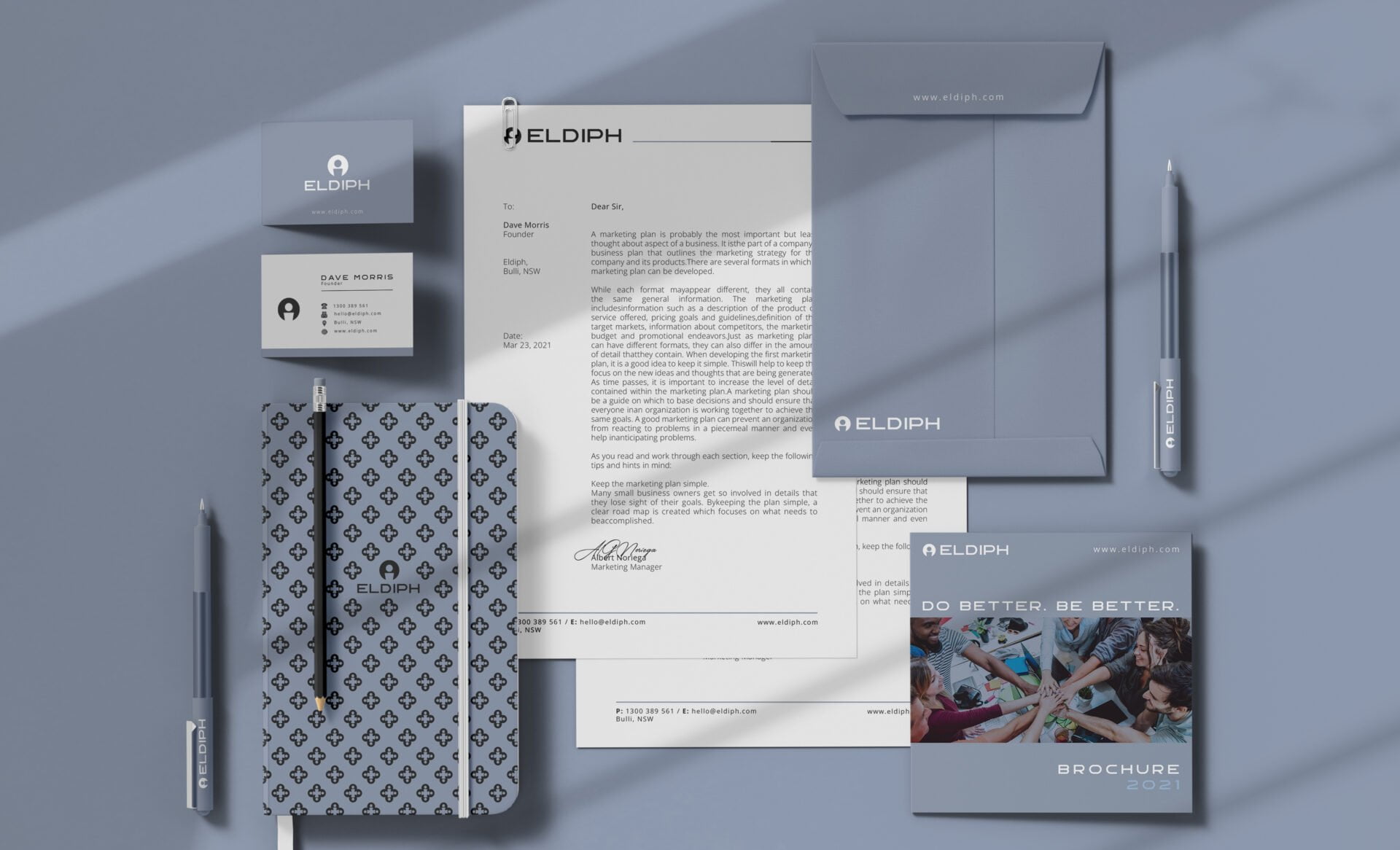
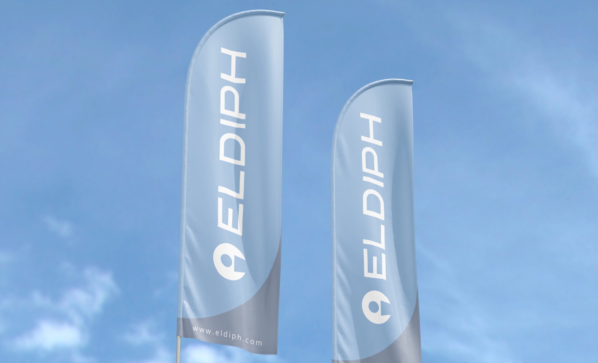
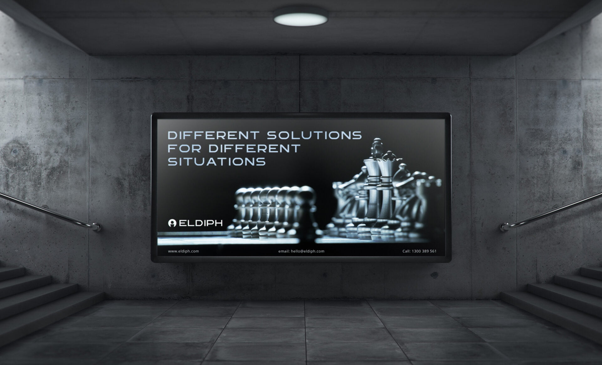
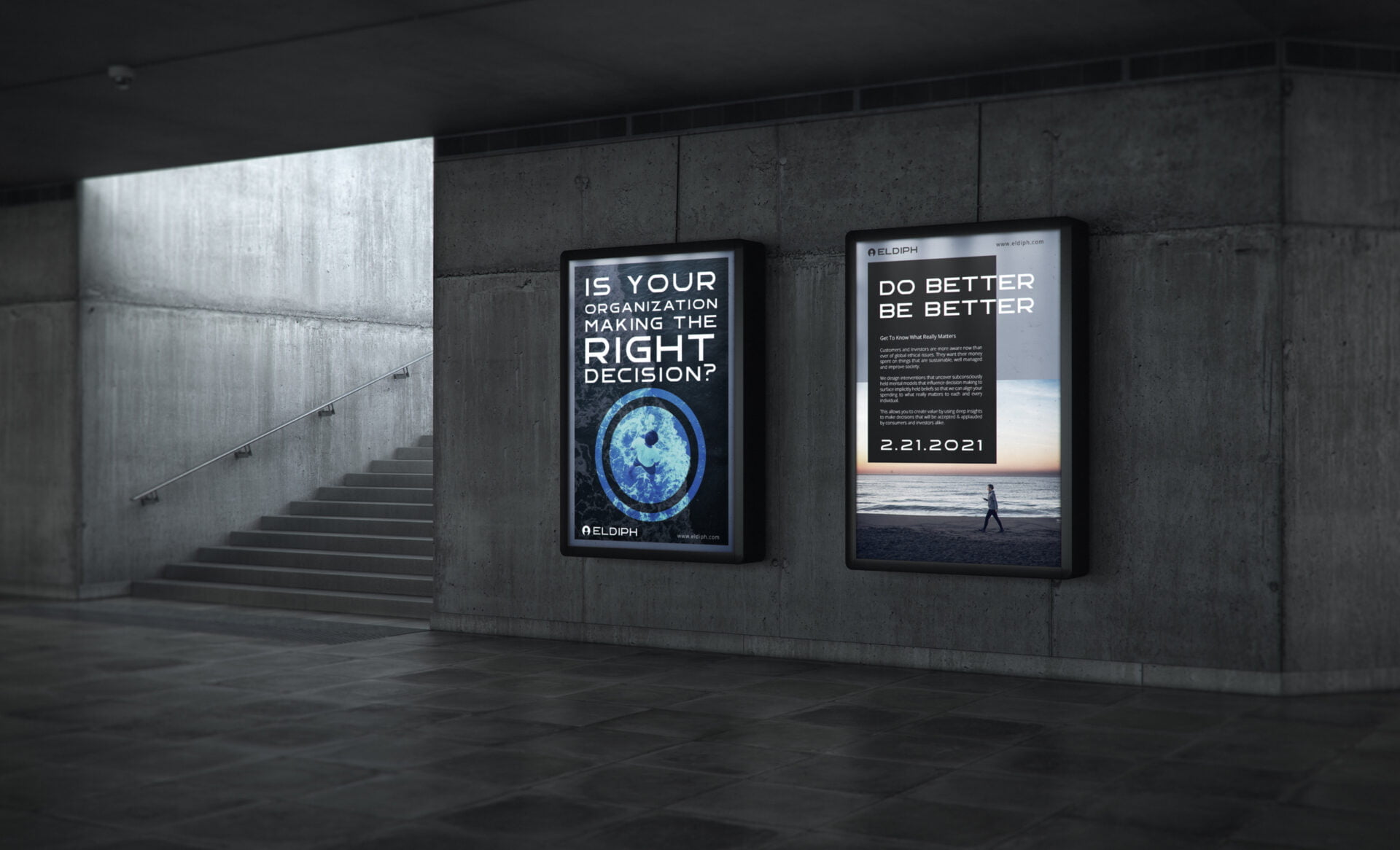
Started making some sketches for the logo and finalized 3 concepts for presentation. The client was happy with one of the concepts and we decided to go with it. From there I presented color palettes and typography for approval. I went for black (#252525) and white for the color and added a grey and a light blue to give it a feel of research and science.
The typography Main Heading is “Gempire” a Modern San Serif that evokes a futuristic personality and Open Sans for subheads and copy.
The brand pattern was created from the logo by reflecting it forming a clover-like pattern.
Need Help With Branding?
Join Waitlist
Build a Brand That Attracts Loyal Customers
Brand Clarity Assessment
Free 3-minute assessment to find out if your brand is clear, aligned, and built to attract the right customers.
| Date: | February 3, 2022 |