Sarkaria Lawyers – Law firm Branding
Location: Brisbane, Australia
Client Type: Law Firm
Project Type: Branding
Learn more: www.sarkarialawyers.com.au
The Challenge: Sarkaria Lawyers is a new law firm based in Brisbane, specializing in a wide range of legal services including Immigration Law, Family Law, Business Law, Wills & Estates, and more. As a start-up, the firm needs to establish a strong brand presence in a competitive market. The challenge is to develop a professional, approachable brand that builds trust quickly, conveys expertise, and appeals to both individual and business clients seeking personalized legal services. They need a consistent and memorable identity that reflects their mission of being affordable and reliable legal partners.
The Approach: To tackle this challenge, our approach will be centered on creating a brand that is both authoritative and approachable. We’ll conduct thorough market research to understand the target audience’s needs, concerns, and expectations when selecting a law firm. Based on this, we’ll build a comprehensive brand strategy and develop a visual identity that conveys trust, professionalism, and personalized service. The visual components will include a clean, modern logo, along with brand assets like color schemes, typography, and design elements that resonate with the values of Sarkaria Lawyers.
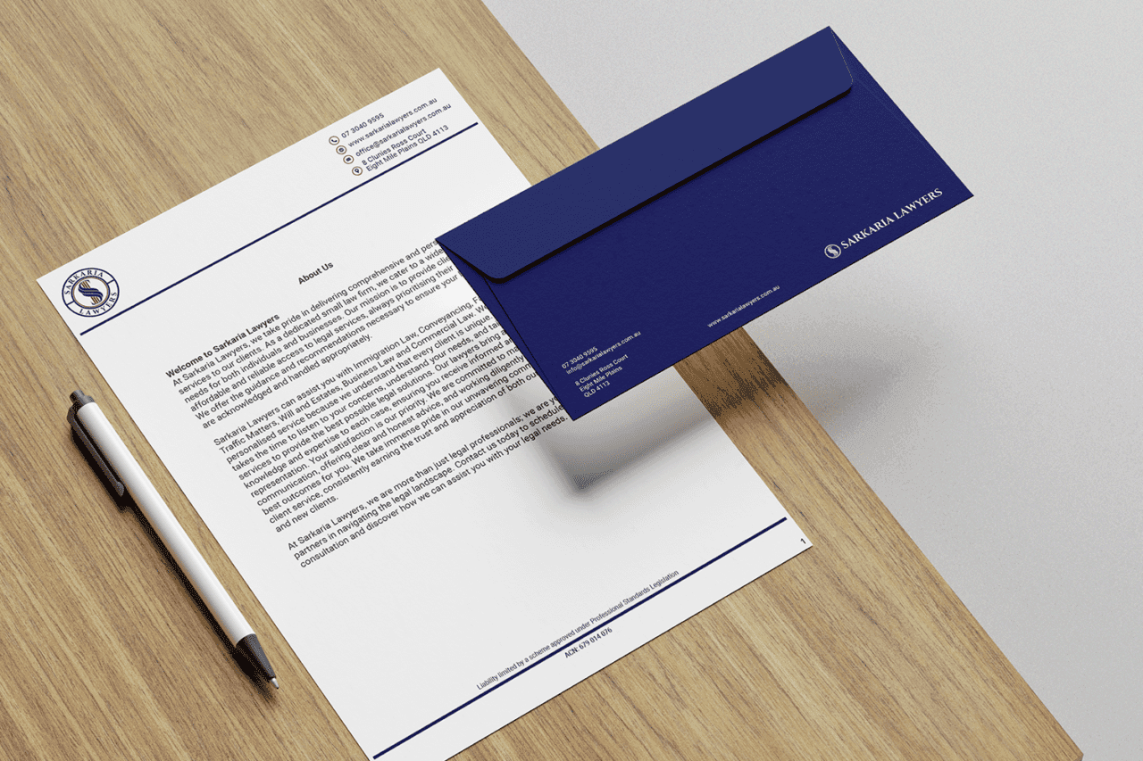
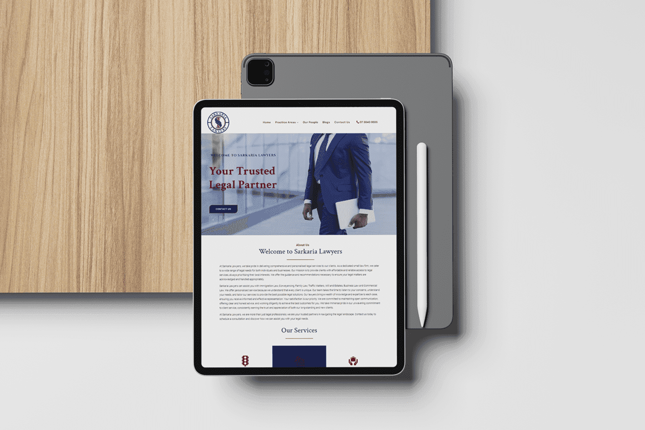
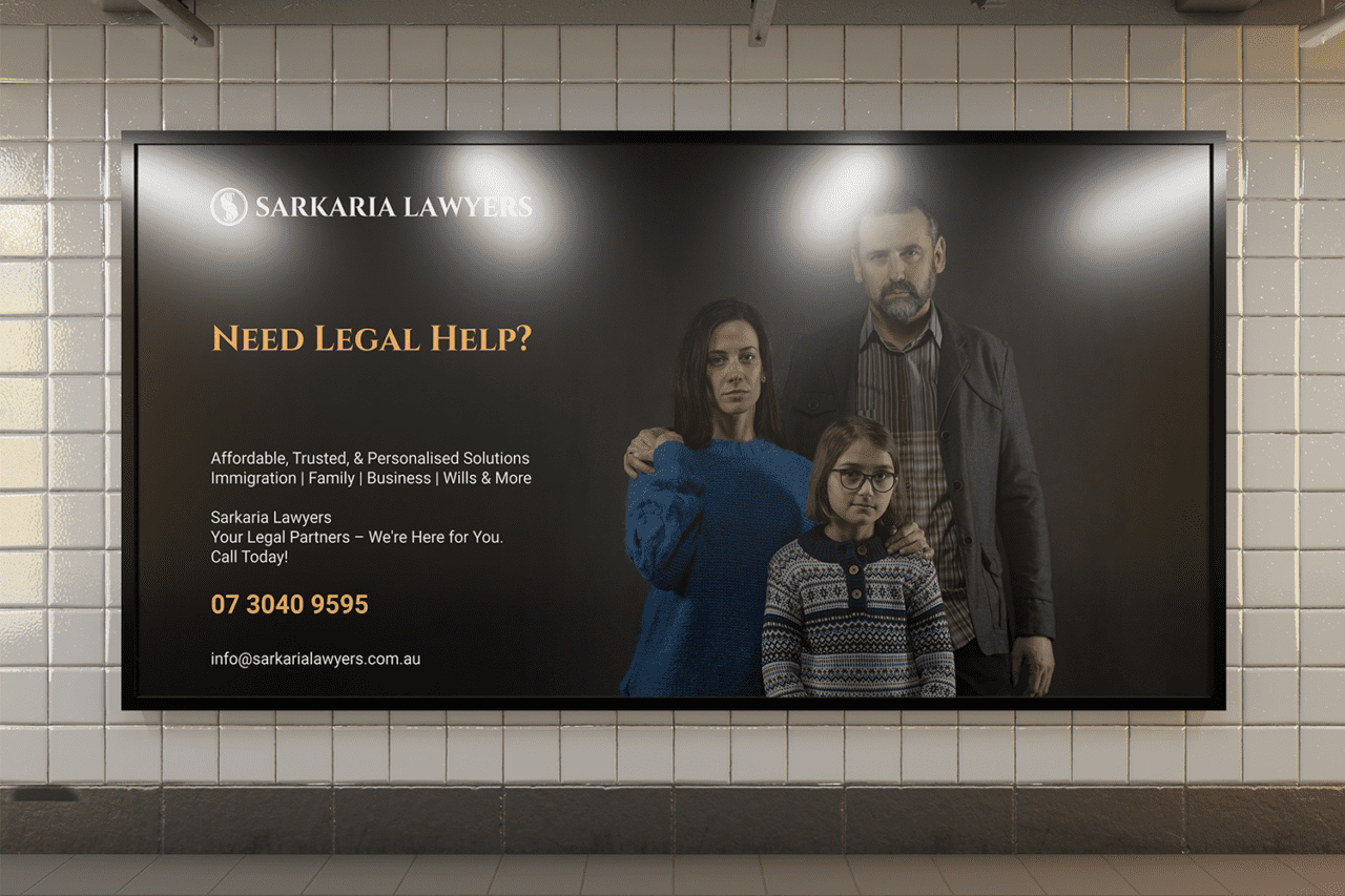
Brand Strategy: The brand strategy focuses on positioning Sarkaria Lawyers as a client-centered law firm that offers trustworthy, accessible, and expert legal support. The key messages will emphasize the firm’s commitment to personalized service, transparency, and strong client relationships. We’ll focus on conveying a message of reliability and understanding, making potential clients feel comfortable reaching out for legal support. Consistent brand messaging and visuals will be deployed across all client touchpoints, including the firm’s website, social media, and printed materials.
Brand Identity Design and Logo
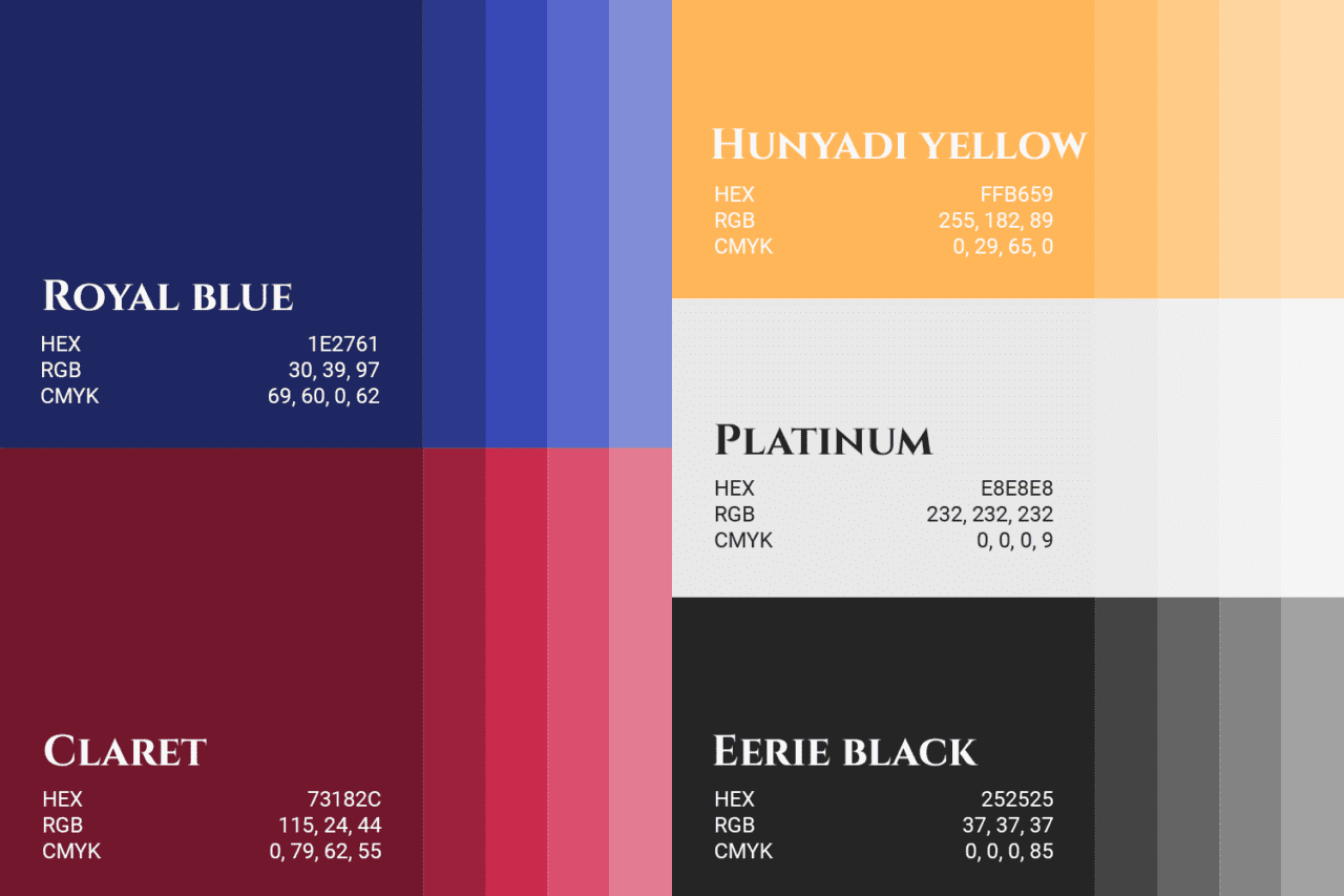
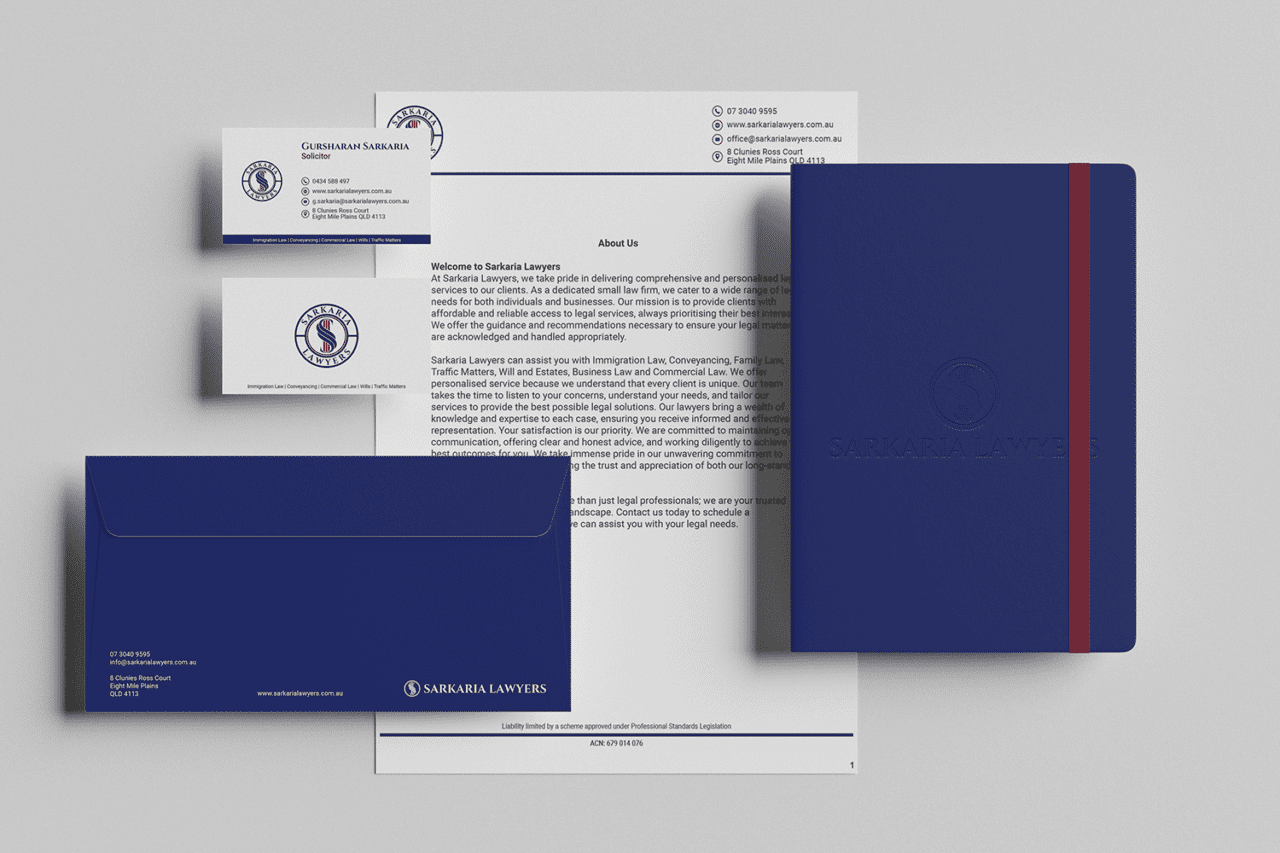
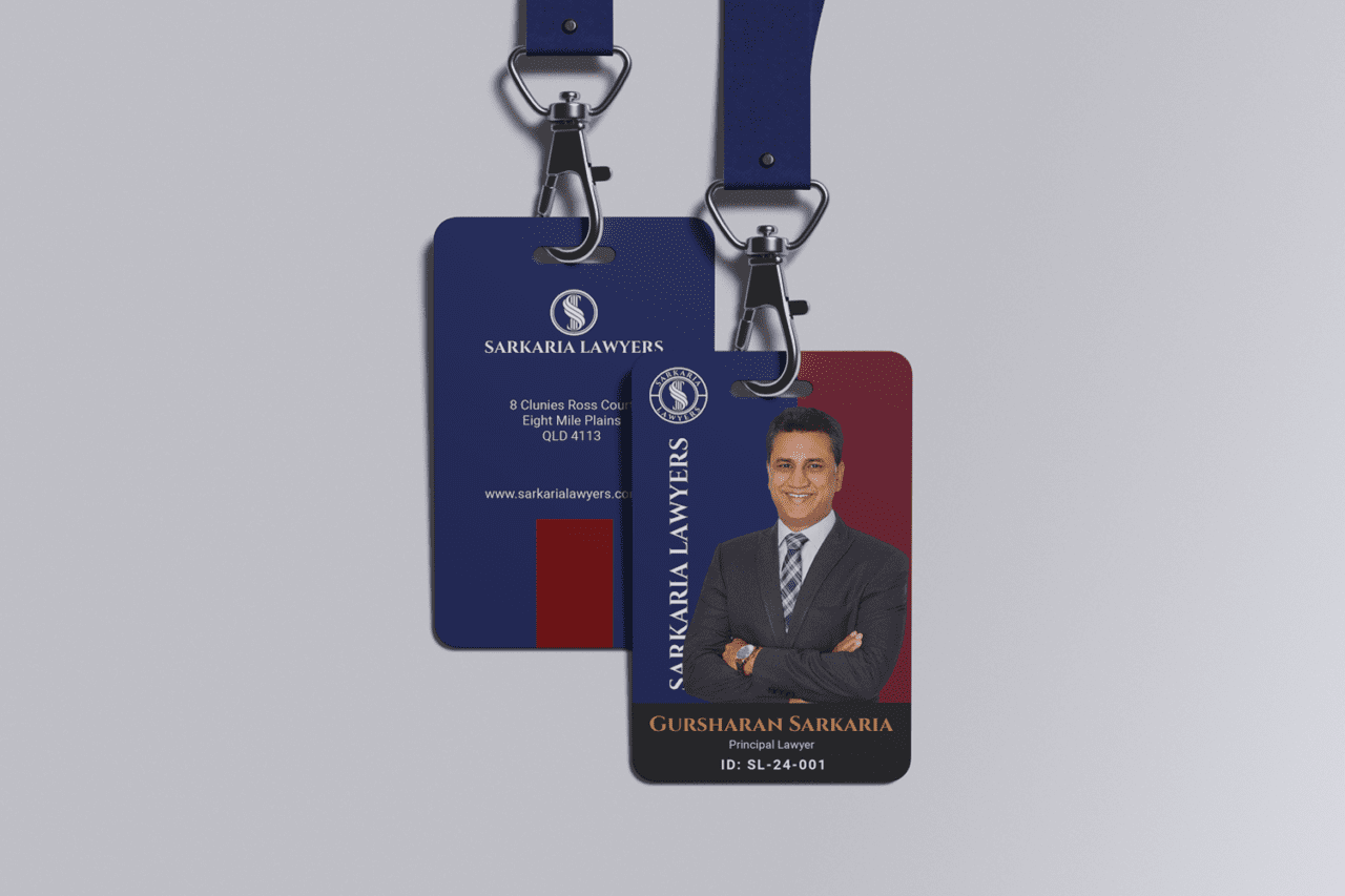
The brand identity for Sarkaria Lawyers balances professionalism with a modern touch, reflecting their commitment to both tradition and personalized service. The color palette consists of royal blue, red, gold, and platinum, each color chosen for its psychological impact:
Royal Blue evokes trust, reliability, and authority, aligning with the firm’s role as a dependable legal partner.
Dark Red symbolizes strength, passion, and action, representing the firm’s dedication to assertively advocating for their clients.
Gold conveys a sense of prestige, success, and excellence, highlighting the high-quality service Sarkaria Lawyers provides.
Platinum adds a modern and sophisticated element, suggesting exclusivity and premium service.
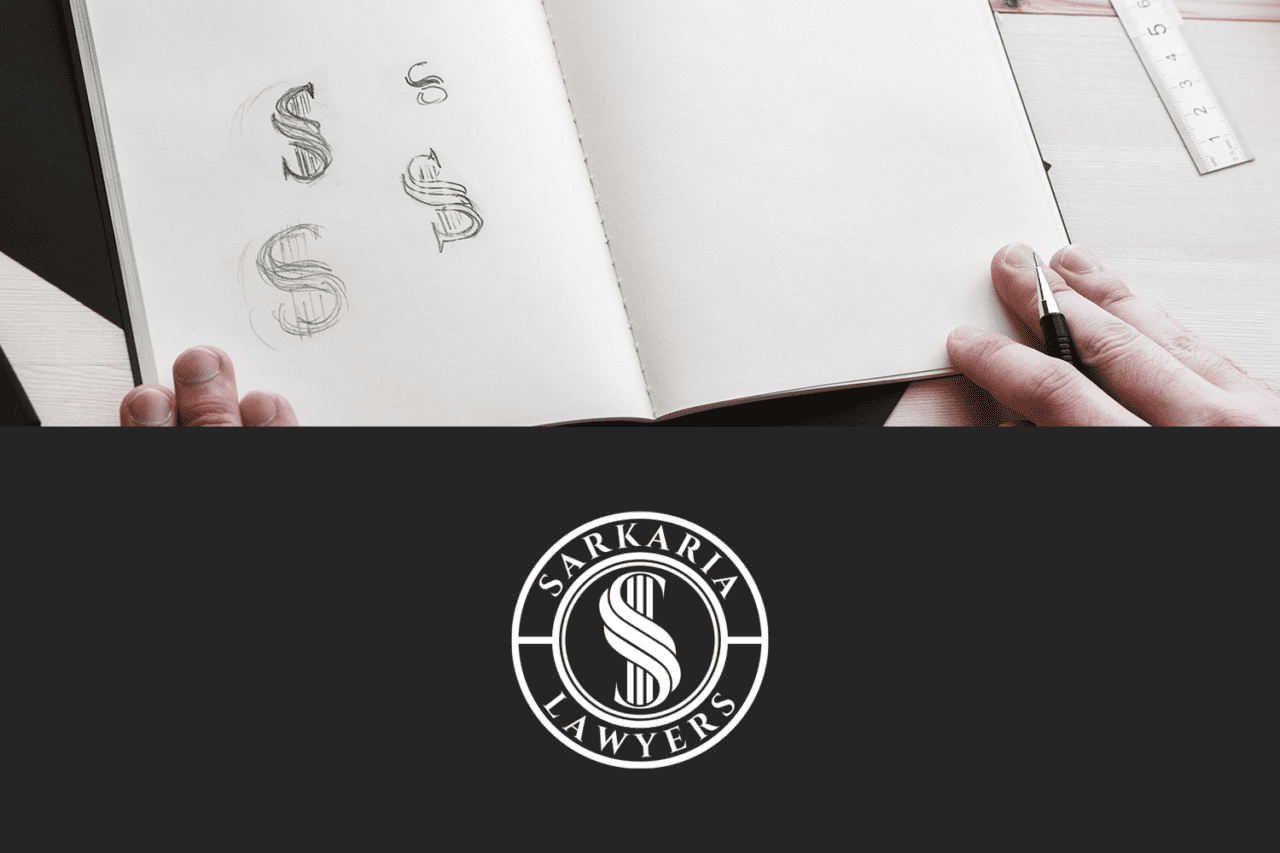
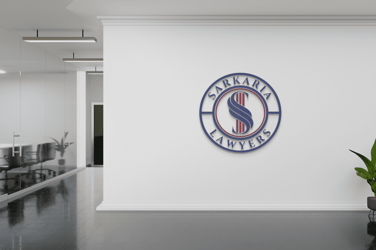
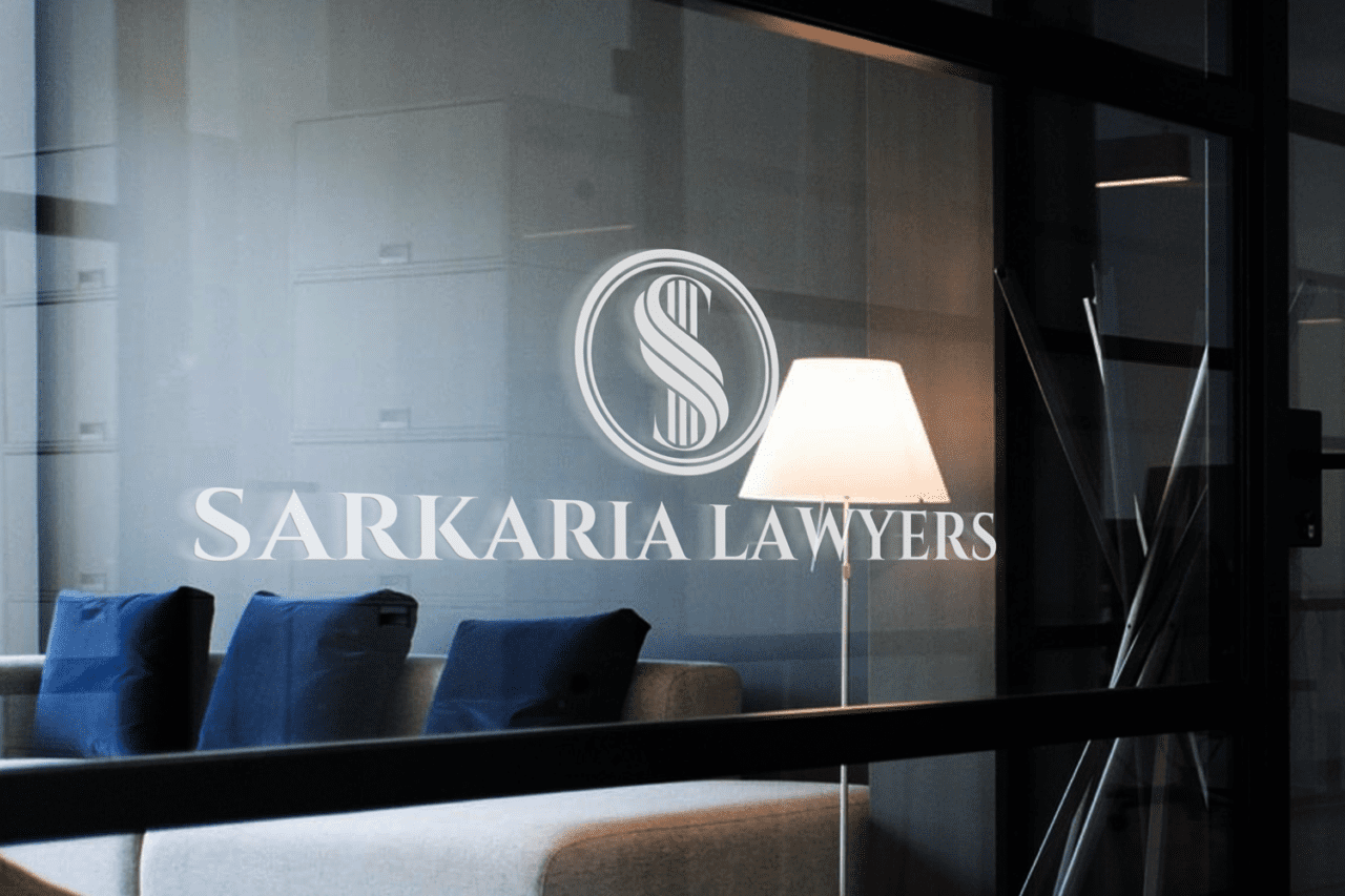
The logo is a lettermark “S” within a circle, designed to be simple yet impactful. The circular shape represents unity and completeness, emphasizing the firm’s holistic approach to addressing legal needs.
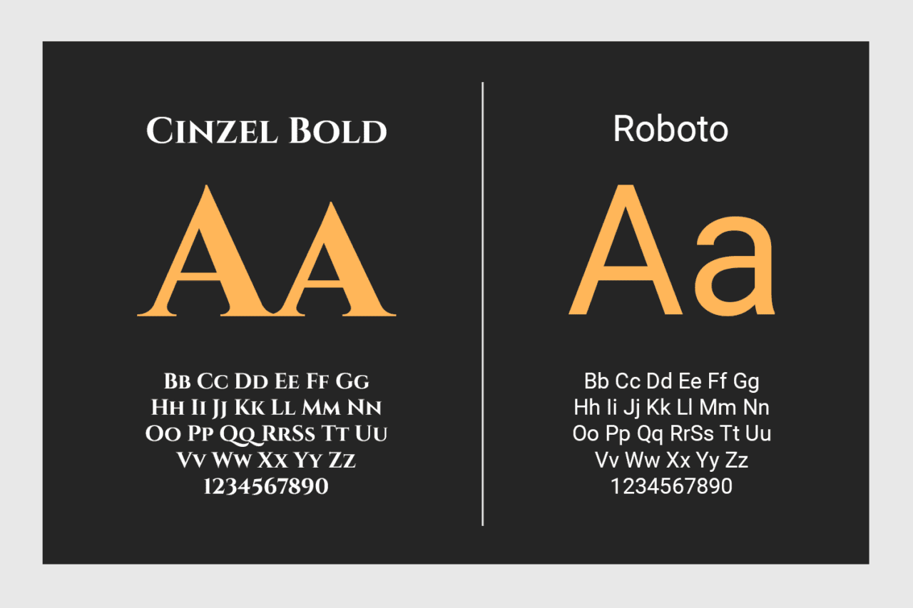
In terms of typography, the heading font is Cinzel a serif to convey a sense of tradition, professionalism, and authority—ideal for a law firm establishing trust. For paragraph text, the firm will use Roboto, a clean and modern sans-serif font that ensures readability and a contemporary feel, balancing the brand’s modern and classic elements.
This combination of colors, logo, and typography creates a brand identity that is not only memorable but also reinforces the core values of trust, strength, and personalized legal expertise.
Need Help With Branding?
Join Waitlist
Build a Brand That Attracts Loyal Customers
Brand Clarity Assessment
Free 3-minute assessment to find out if your brand is clear, aligned, and built to attract the right customers.
| Date: | October 7, 2024 |
