Mario Guerrero Tequila
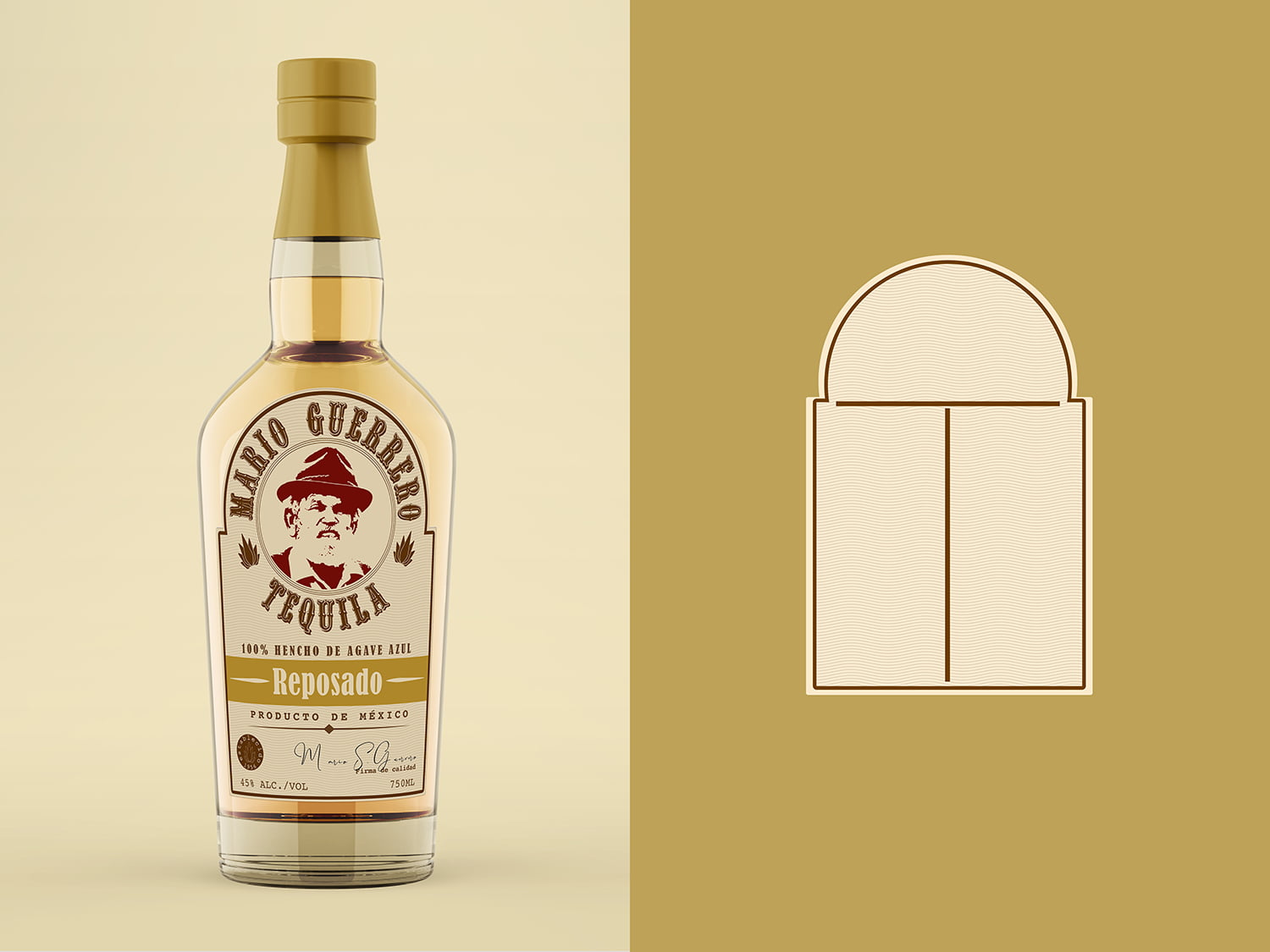
Mario Guerrero Tequila was founded in 1956 by Mario Guerrero and the business remained in the family for more than 60 years before it decided to have a new personality. The family recipe is renowned for being a fortune and has paved the way to put Mario Guerrero Tequila in the mind of many tequila enthusiasts.
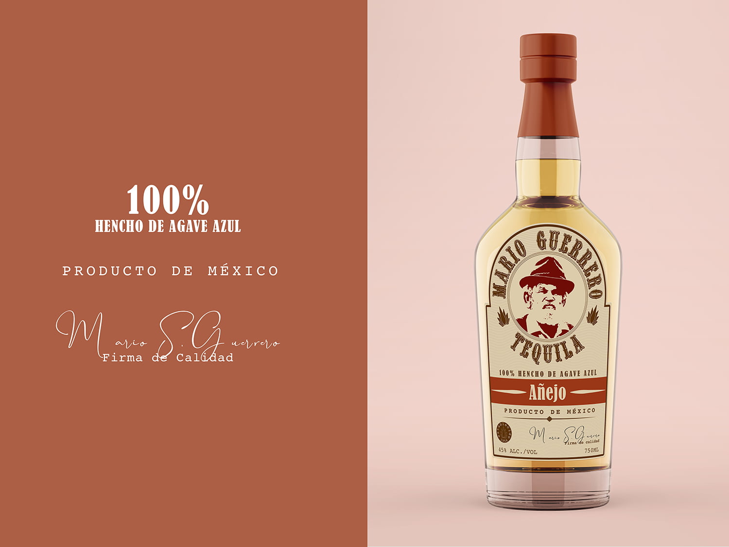
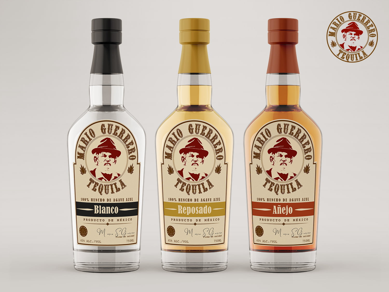
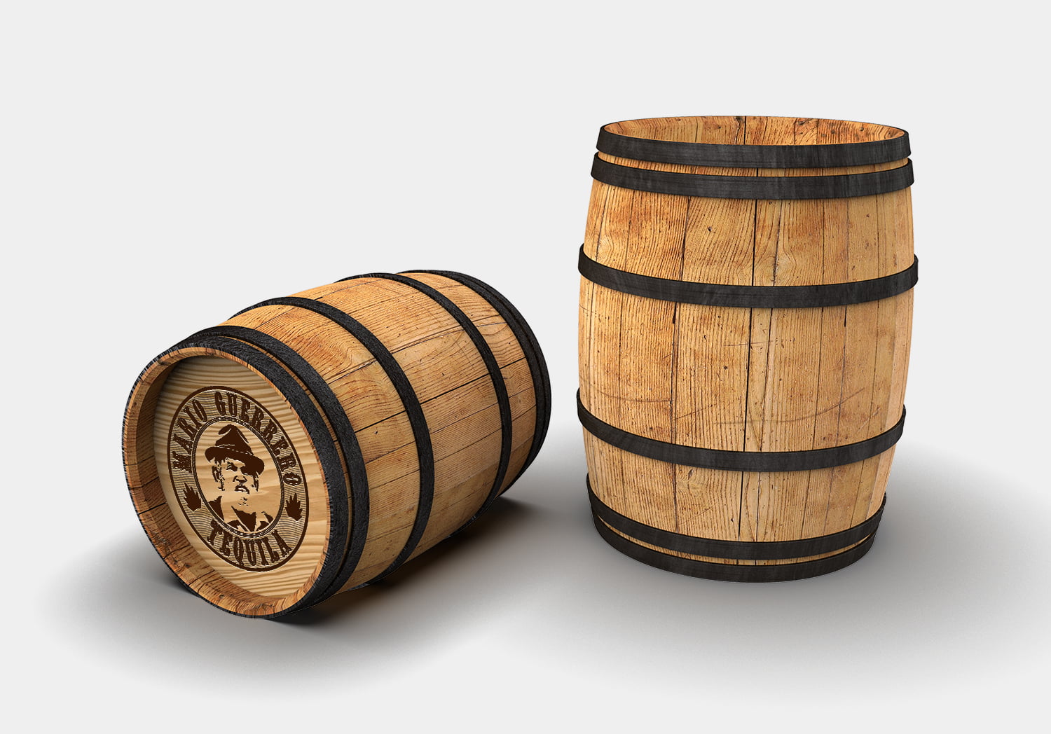
It’s a premium brand that offers a unique tasting experience due to the aging process and the blue agave used, particularly its Añejo form, Mario Guerrero Tequila produces three variants, Blanco, Reposado, and Añejo these are considered one of the best tequilas produced from port barrels and is widely regarded as a top option for a delicious tasting spirit.
Location: Jalisco, Mexico
Client Type: Tequila Distillery
Project Type: Logo, Packaging
The Challenge: The company needed to refresh the look of its tequila lineups. The brand is looking to highlight the Guerrero family heritage, quality, and craftsmanship behind the spirit and elevate its visibility and presence internationally. The first-ever rebrand in Mario Guerrero Tequila history will roll out globally, driving the brand’s continued long-term growth in existing North American markets, as well as expansion efforts in new, emerging tequila markets — Japan, Russia, and the brand’s first attempt into South Korea.
The Approach: Bringing a tequila brand to life in any country is always an interesting challenge. The product was entirely Mexican, but to be sold in North America, Russia, and Asia. The brand needed to translate retro-modern elements to its audience while maintaining authenticity and without drifting into stereotypes.
I immersed myself by doing research about Mexican culture specifically in the area of Jalisco and the Guerrero family history. I created an identity system that gives a nostalgic feel and is uniquely Mexican that will connect to consumers without being part of the mainstream.
| Date: | December 8, 2020 |


