Saint Brigid Brewing Co.
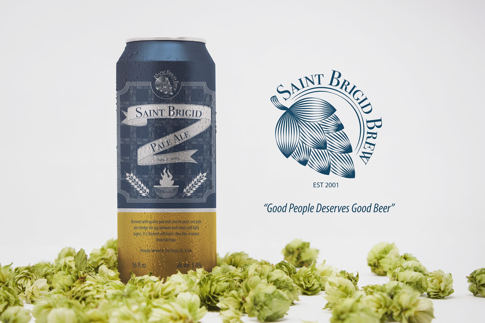
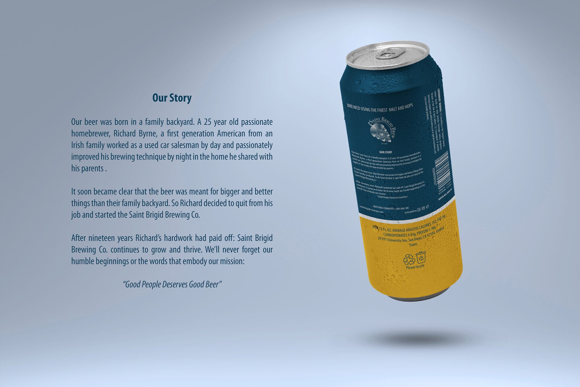
A beer company that was born in a family backyard. A 25-year-old passionate homebrewer, Richard Byrne, a first-generation American from an Irish family worked as a used car salesman by day and passionately improved his brewing technique by night in the home he shared with his parents. It soon became clear that the beer was meant for bigger and better things than their family backyard. So Richard decided to quit his job and started the Saint Brigid Brewing Co. After nineteen years Richard’s hard work had paid off: Saint Brigid Brewing Co. continues to grow and thrive. We’ll never forget our humble beginnings or the words that embody our mission: “Good People Deserves Good Beer”
Location: San Diego, CA, U.S.A.
Client Type: Alcoholic beverage company
Project Type: Logo and packaging design
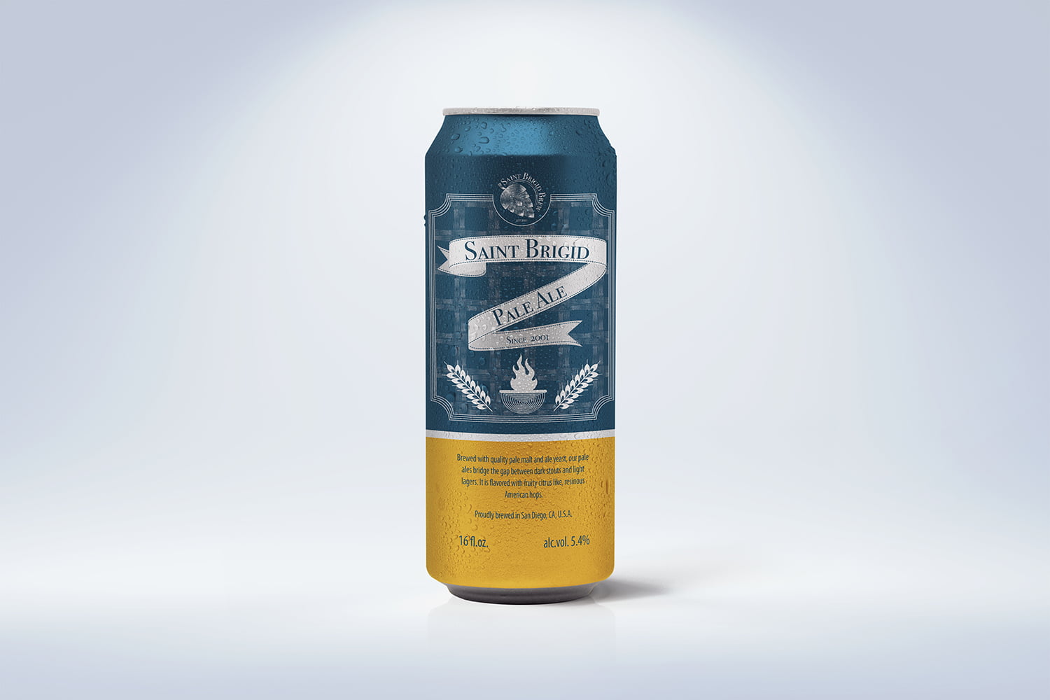
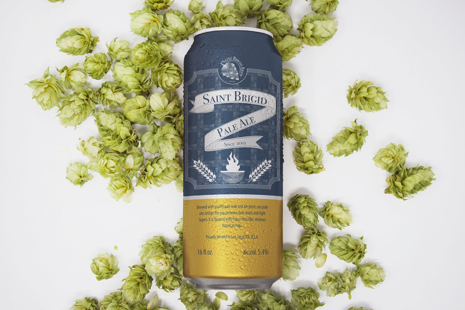
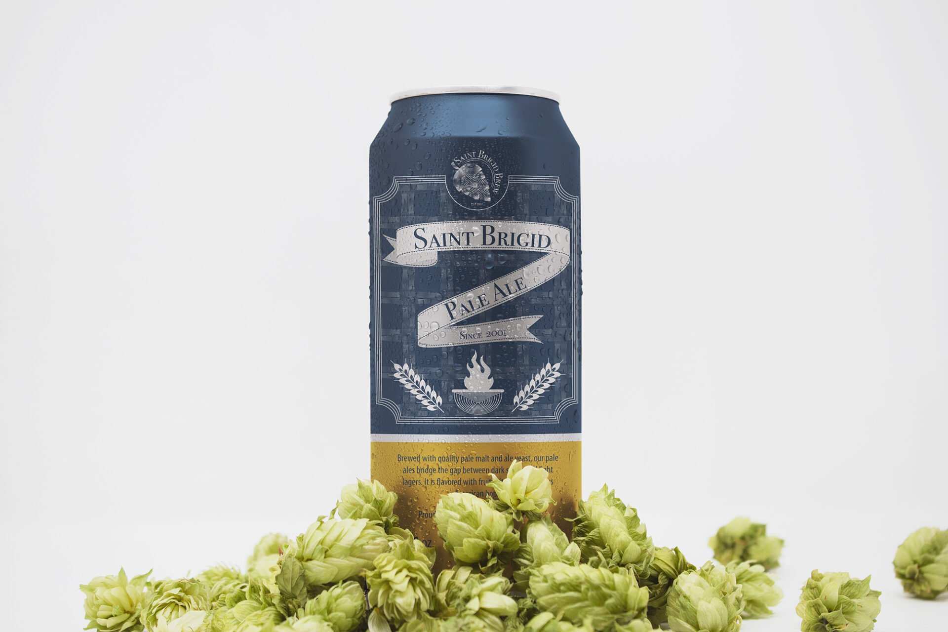
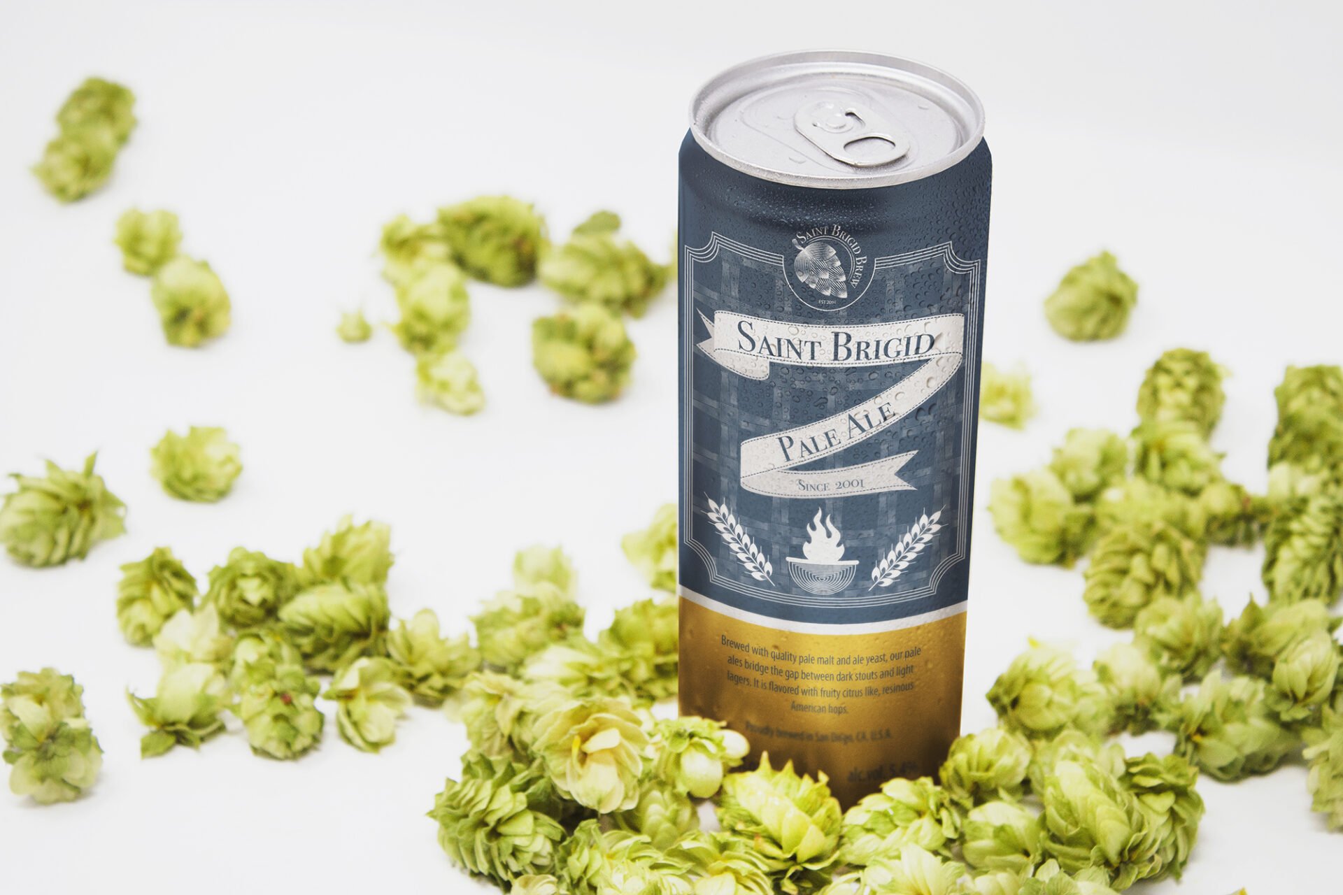
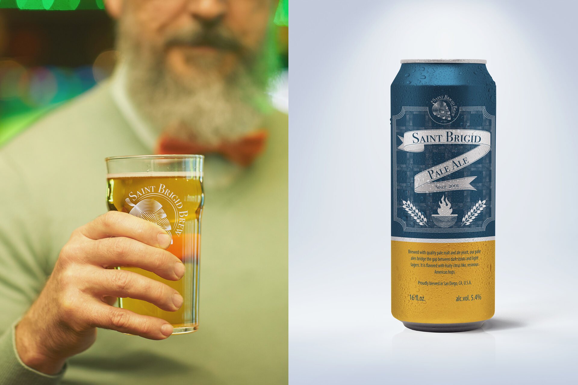
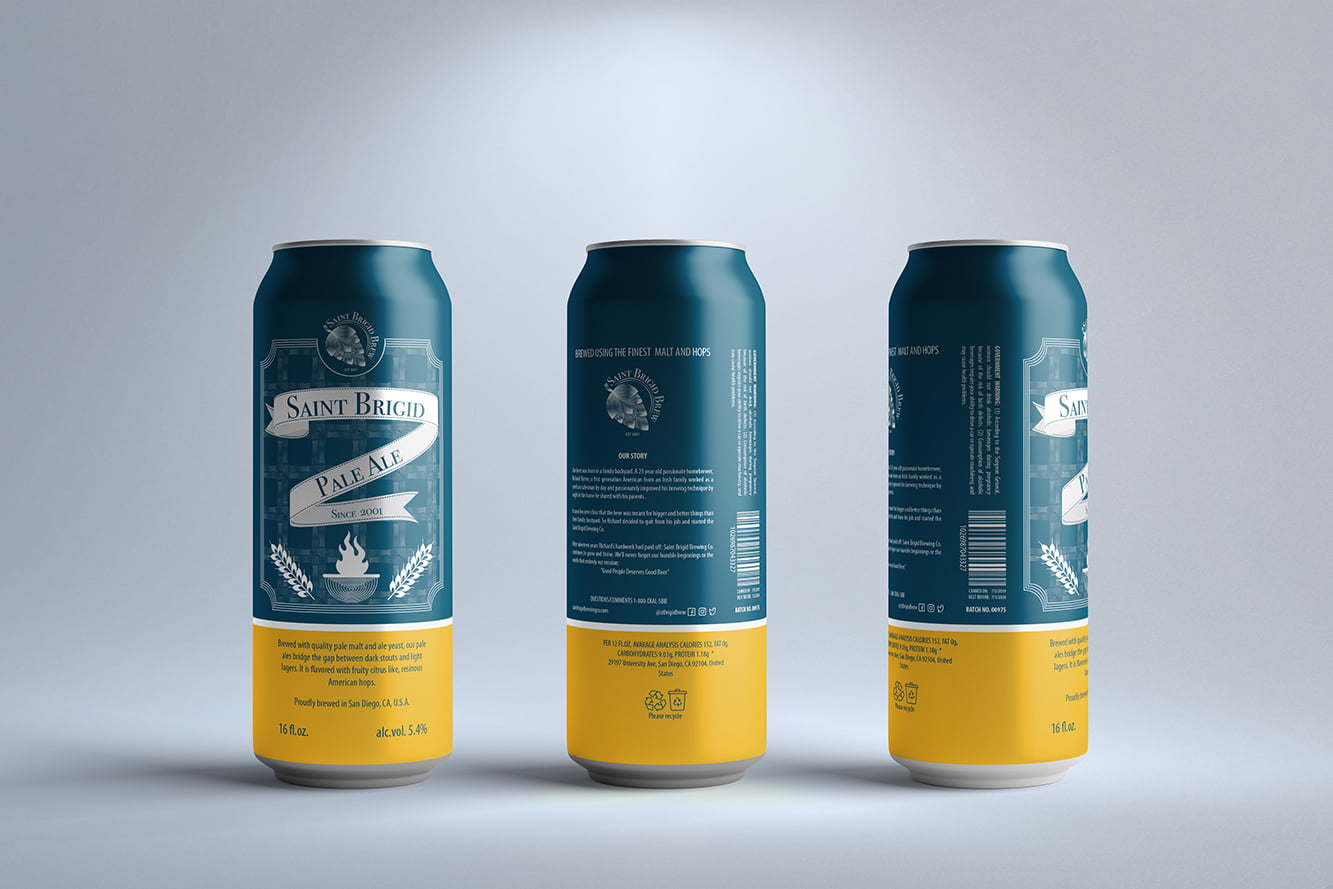
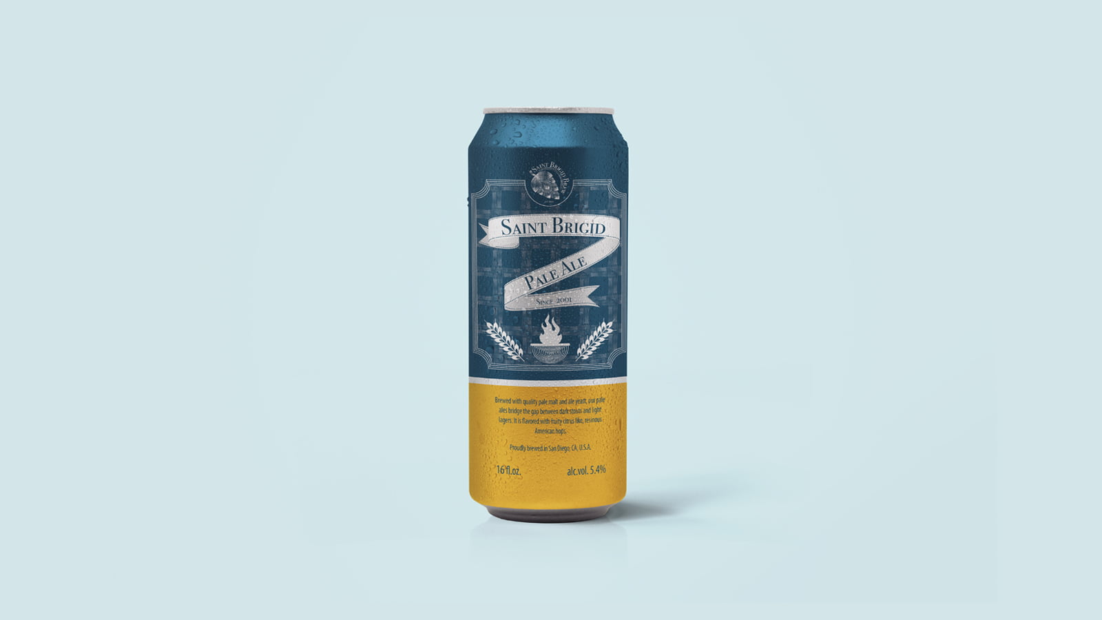
The Challenge: Saint Brigid Brewing Co. is introducing their newly innovated pale ale that is brewed from high-quality pale malt and ale yeast. Their secret recipe has resulted in a fruity scent and citrus-like taste on their brew.
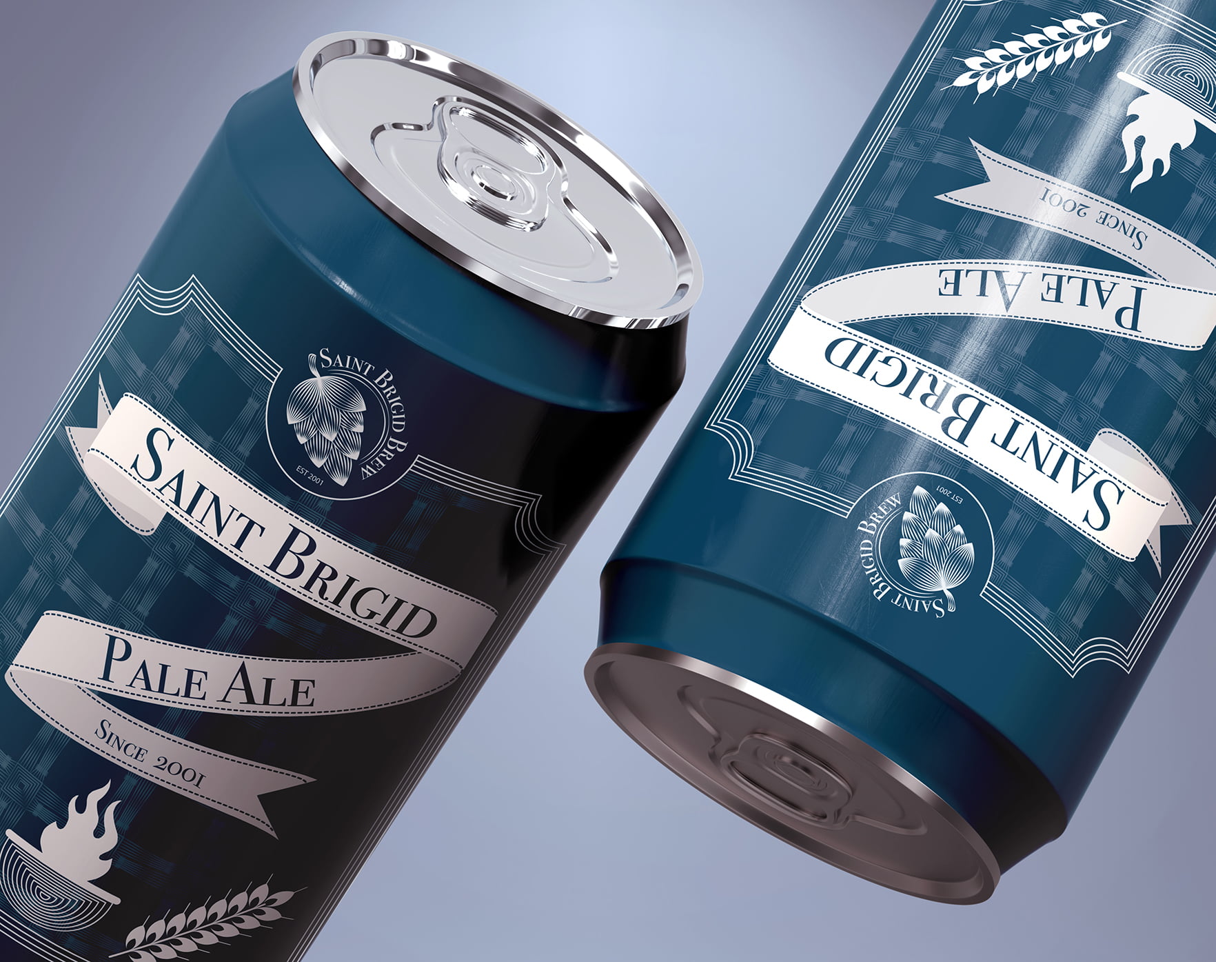
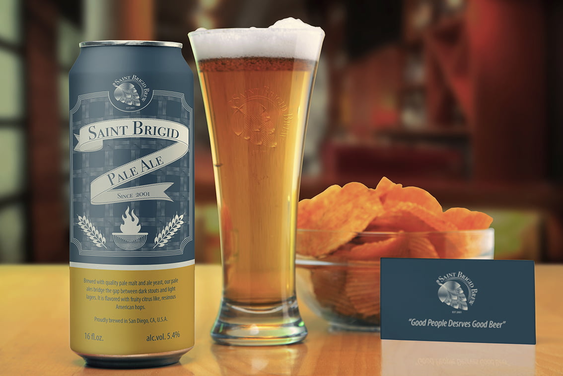
The alcoholic beverage industry is saturated and the shelves are filled with fancy-labeled beer products. My challenge was to re-create their dated existing logo and packaging that will position the product as a premium beer that will attract working professionals as their go-to beverage after a long day at the office.
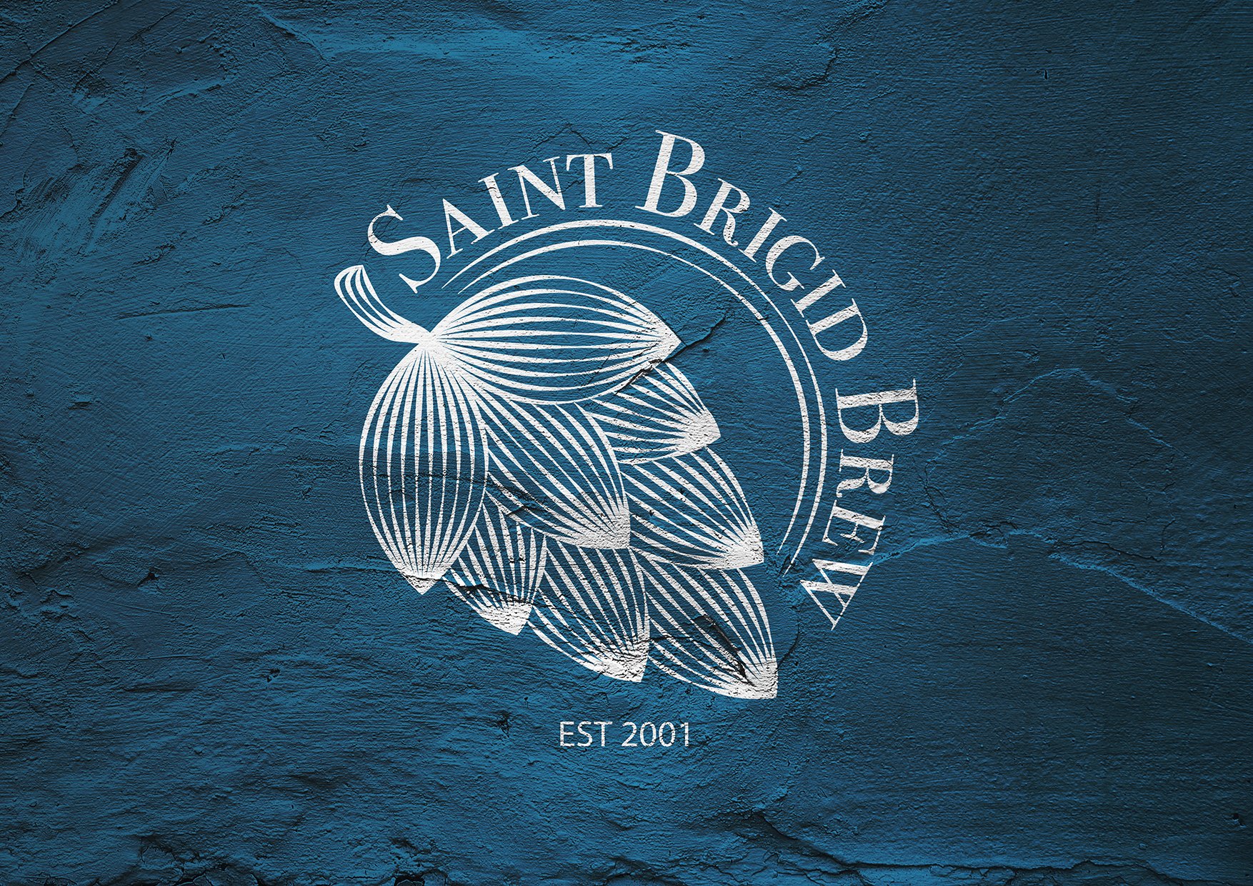
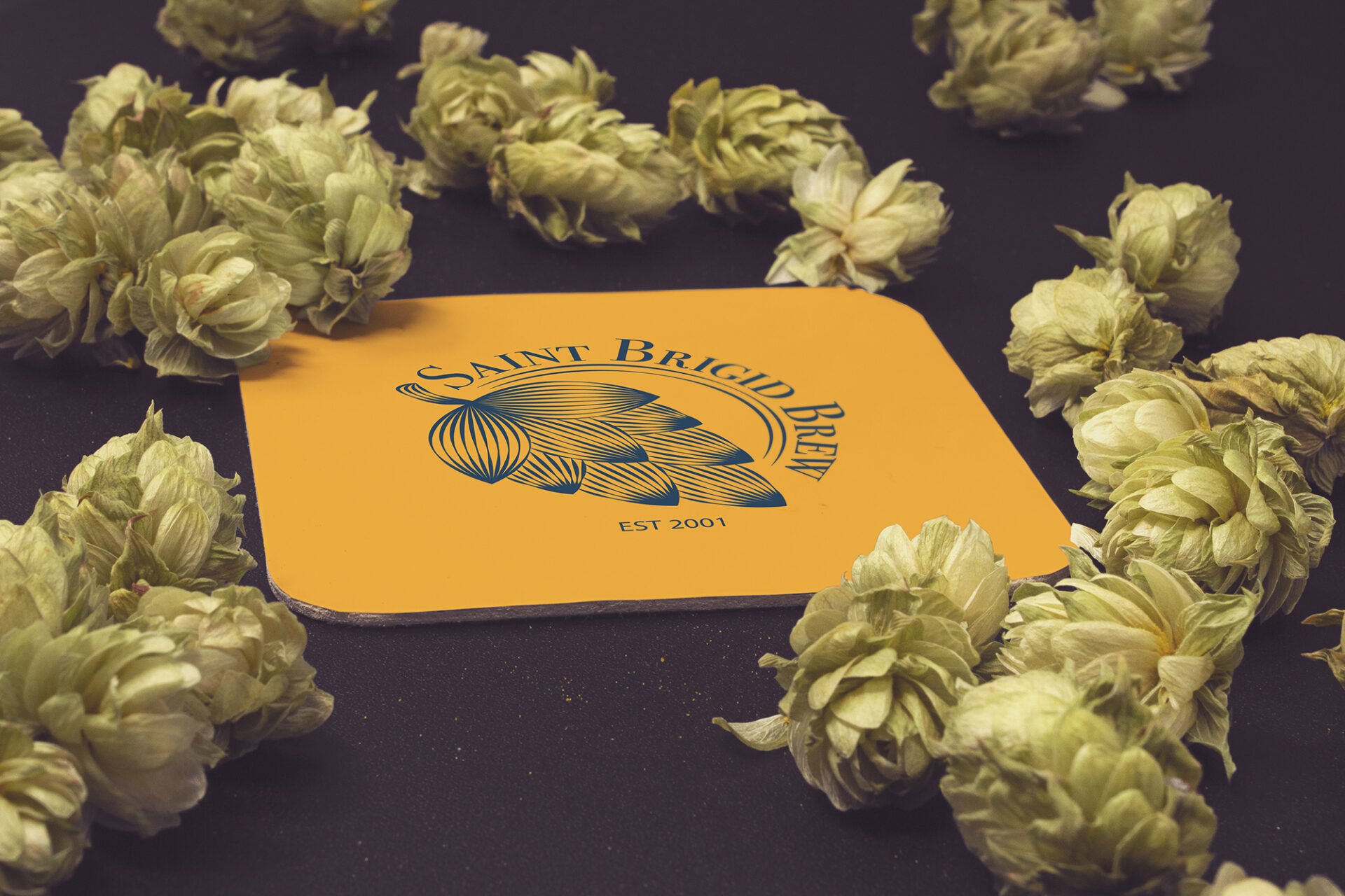
The Approach: Because Saint Brigid’s outdated logo doesn’t work well with the modern image, I have decided to simplify the logo while maintaining its relevance. For the packaging, I designed bold, eye-catching packaging that avoids the vibrant and colorful beer can trends. This forward-looking design makes Saint Brigid’s pale ale stand out on the shelves.
Combining the color palette with a bold, exciting, and fearless personality makes the brand engaging both in physical and digital touchpoints.
| Date: | November 16, 2020 |