Have you ever wondered why certain brands seem to capture attention immediately? Meanwhile, others struggle to stand out. It’s not their logo or catchy tagline… it’s their use of color.
Color isn’t decoration but a powerful tool influencing perception and behavior. As a start-up, understanding color psychology could be your secret weapon. It helps attract more audiences and keep followers for your brand.
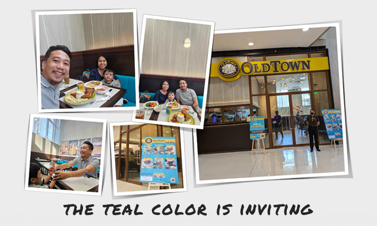
Teal Couch Made it Feel Right
A few weeks ago, I was shopping at a mall with my wife and son when we decided to take a break. We searched for a place to have dinner in the newly opened section of the mall. We ended up at a restaurant with a teal-colored couch that felt welcoming and relaxing. (in case you don’t know teal is my brand color)
At the time, we didn’t think much of it. Later, we realized that the colors of the restaurant were what drew us in and made us feel right at home. It’s funny how colors can influence our decisions without us even realizing it.
By the way, the restaurant was OldTown White Coffee. It was our first time dining there and we had a great experience.

Ignoring Color Psychology Can Be Dangerous
I remember before we got to OldTown restaurant, we opted to go to Pancake House because it was the closest to us. But, when we got there the place was dark and uninviting. My wife and I love Pancake House, we love their classic pan chicken. But the feel and energy with that specific branch didn’t resonate with us.
Now, imagine walking into a store that’s painted in dull, lifeless colors. You’d likely feel uninspired and might even leave without purchasing anything. The same goes for your brand. Without a strategic use of color, your brand might blend into the background.
You could miss the chance to make a lasting impression.
For start-ups, this is a critical challenge. How can you make your brand irresistible in a crowded market?
How Start-Ups Can Leverage Color to Stand Out
The good news is that color psychology offers a proven approach. It helps you create an emotional connection with your audience. By understanding the emotions and associations tied to different colors. You can design your brand identity in a way that resonates with your target audience.
Color is the first thing your audience will notice about your visual branding. It creates an immediate impression of your products. Studies show that 90% of snap judgments are influenced by color alone.
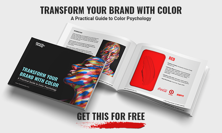
Below is a color psychology guide you can use as a reference to help you in choosing your brand color.
 You can get it here for free.
Let’s look at how five successful brands use color psychology to their advantage.
Real-World Examples:
Coca-Cola (Red): Red is known for evoking excitement, energy, and passion. Coca-Cola’s iconic red branding creates a sense of happiness and liveliness. This aligns perfectly with their “Open Happiness” slogan. For start-ups, red can be a great choice if you want to energize your audience and build a sense of urgency.
Tiffany & Co. (Blue): Blue often symbolizes trust, loyalty, and calmness. Tiffany’s use of a unique robin’s egg blue conveys a sense of luxury, reliability, and timeless elegance. Start-ups looking to establish credibility or convey sophistication might consider shades of blue.
McDonald’s (Yellow): Yellow is the color of optimism, warmth, and cheerfulness. McDonald’s uses yellow to create a welcoming and friendly atmosphere. This encourages feelings of joy and comfort. For start-ups, yellow can make your brand feel more approachable and inviting.
Apple (White): White represents simplicity, cleanliness, and modernity. Apple’s minimalist use of white emphasizes its brand’s focus on sleek design. It also highlights their commitment to innovation. Start-ups that emphasize clarity and sophistication should incorporate white into their branding. This choice enhances a clean and professional image. It helps convey a clean and modern feel to the brand.
Spotify (Green): Green is associated with growth, health, and relaxation. Spotify’s vibrant green reflects creativity and renewal. This color aligns with their mission to deliver fresh, new music to listeners. Start-ups in the wellness or creative industries might find green to be a fitting choice.
How Can You Leverage Color to Stand Out
You’ve seen how established brands use color to shape perception. Now, here’s how to apply these principles to your start-up.
Define Your Brand Personality: Identify the emotions and values your brand should convey. Is your brand adventurous, trustworthy, or innovative? Use these traits to guide your color choices.
Research Your Audience: Understand the color preferences of your target market. If your audience values sustainability, using green can resonate with them. This color choice aligns with their environmental concerns.
Test and Iterate: Don’t be afraid to experiment with different color schemes. A/B testing your brand’s visuals on social media reveals what resonates most with your audience. This approach provides valuable insights for refining your strategy.
Your Action Plan
Ready to make your brand more vibrant and engaging? Start by evaluating your current color scheme. Does it reflect your brand’s personality and appeal to your target audience? If not, it might be time for a color refresh. Remember, even small tweaks can have a big impact.
Our Final Thoughts
Color is not an aesthetic choice; it’s a strategic tool. It can set your brand apart and help you connect with your audience more. Understanding and applying color psychology helps your start-up create a memorable brand identity. This not only attracts followers but also turns them into loyal advocates.
Until next time, stay colorful! -Chester

P.S. If you found this article helpful, please share it with others who might benefit from it! Your support helps me reach more people and provide valuable insights.

I help early-stage startup founders build brands that actually get traction. No fluff, just clear strategy and design that speaks to the right people.Want to find out if your brand is ready? 👉Take the quiz or Join the waitlist